Three clicks for a logo
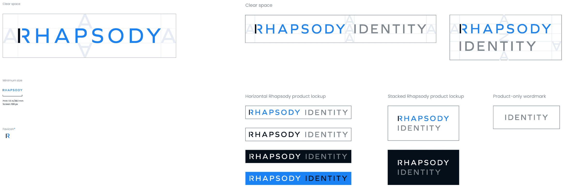
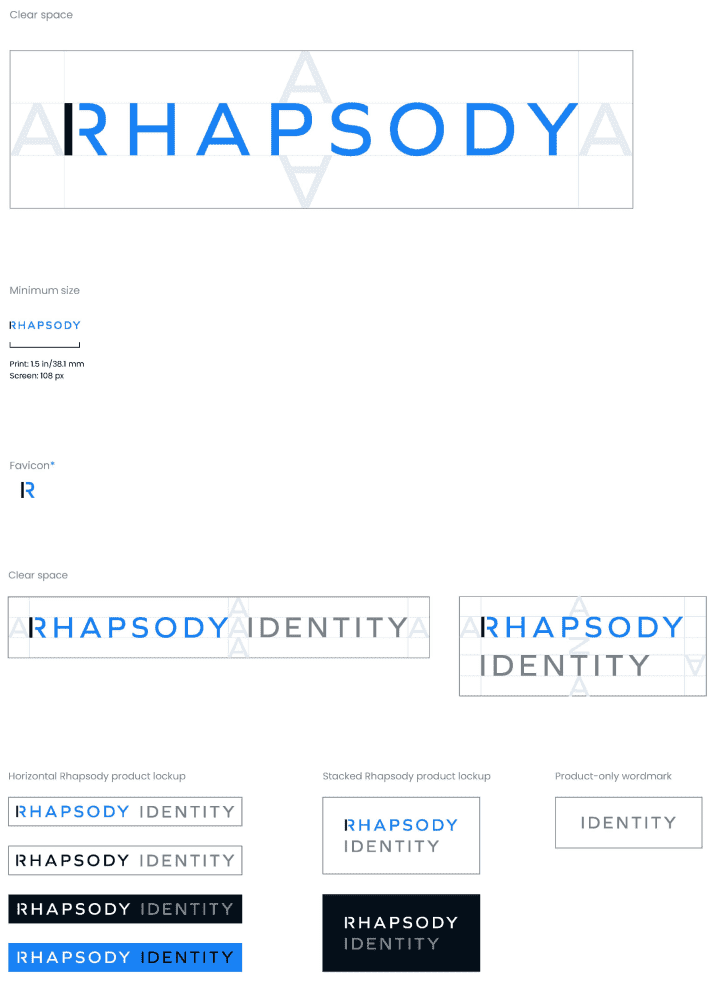
We developed a logo that supports lockups with all the product names.


In healthcare technology, mergers and acquisitions are as common as new friends on the road to Oz. When startups develop the next big solution, they also catch the eye of the great and powerful players looking to grab hold of more market share. For those larger companies, the challenge is making acquisitions without alienating customers and splintering their own brand.
When Rhapsody brought us in they had just purchased two companies to round out their suite of healthcare interoperability solutions. The trouble was, the two new acquisitions included IaaS and PaaS offerings that not only had to speak to their distinct audiences, but also get along with Rhapsody's existing SaaS solution.
Ultimately, we were there to help Rhapsody on its journey to build a new brand—one that would house the new acquisitions and speak above the tech jargon to focus on advancing better health outcomes. It all started with some messaging magic.
Distill the value of Rhapsody—it connects people to make healthcare happen
Redefine Rhapsody to include new capabilities—it's not just about the technology
Create value statements for each audience segment—it’s more than an umbrella brand
Pull common threads front and center—its solutions work together to change the industry

With rigid lines and dark colors, the original Rhapsody brand didn't quite embody its commitment to fostering connections to build a healthier world.
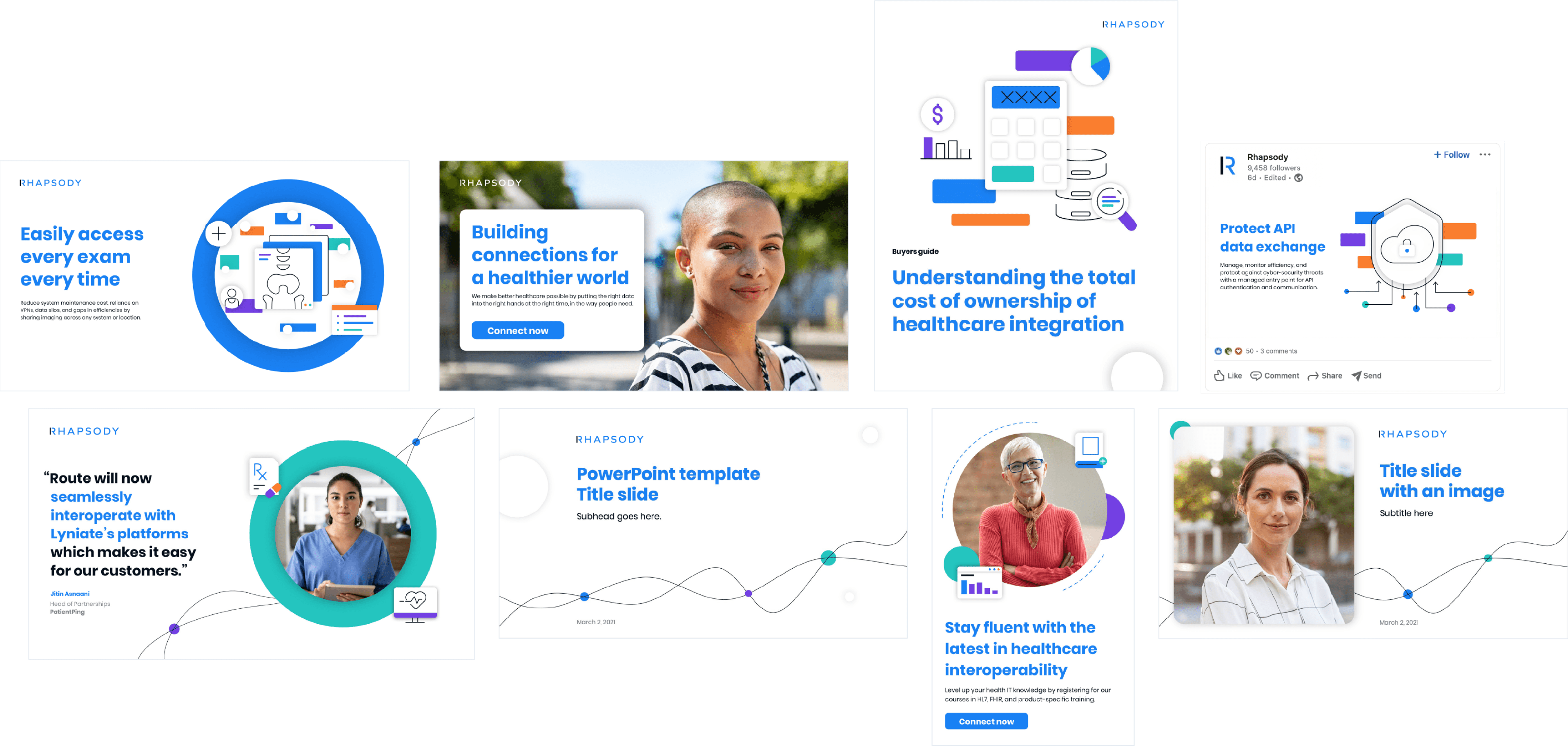
So we mixed things up, giving the design more heart. We gave the lines connection points and added some bends and brighter colors for a perfectly imperfect human touch.
We developed a logo that supports lockups with all the product names.

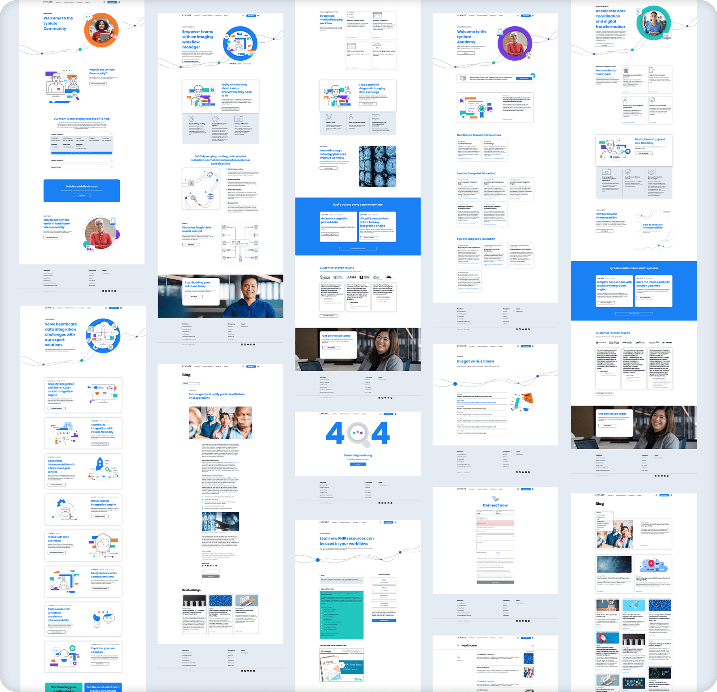
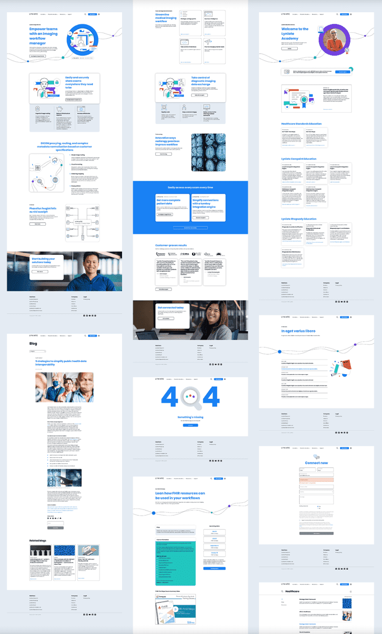
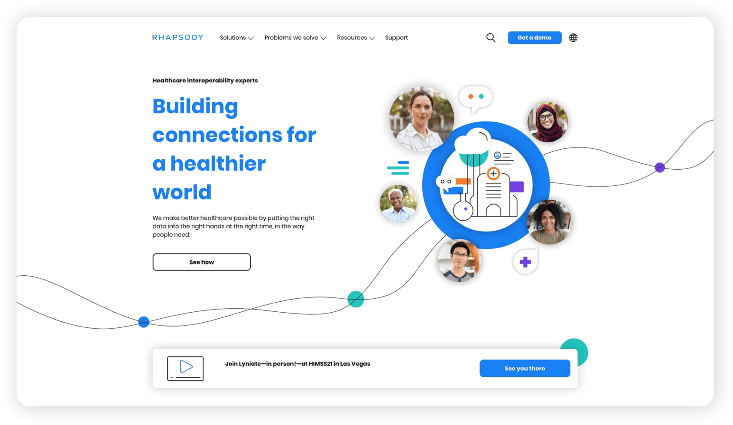
Of course, we needed a home for the new messaging and brand to live, so we built the Rhapsody website, told the acquisitions to click their heels three times, and voila!
