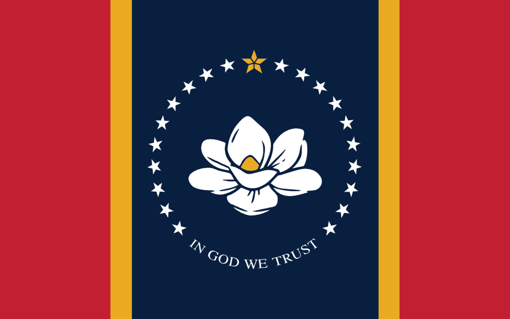
America’s trajectory hangs in the balance this November, but one of the ballot measures I’m most excited about is one I cannot vote on. In six days, Mississippi voters will have the opportunity to approve or reject the final design for a new state flag. After more than 20 years of serious efforts to replace the old racist flag, which featured the confederate stars and bars, widespread protests stemming from George Floyd’s murder finally turned the tide with state lawmakers this summer.
I’m excited not just because this marks the removal of a hateful symbol, but because I’m a lifelong vexillophile—a lover of flags. In many ways, what I love about flags is what I love about marketing: the limitations. There is so much to say and represent, but just like marketing, flags depend on simplification to be effective. So, let’s review the proposed flag design through the lens of some classic 2A adages that help shape our approach.

Less is more work
Like our marketing work, the best flags do more with less clutter. Flags flap, drape, and must be recognizable from afar, so they should be designed for practicality. Mississippi’s new proposed flag benefits from simple symmetry and limited colors, but unfortunately it includes lettering. It’s not the designers’ fault, the words “In God we trust” had to be included. Lettering doesn’t scale down well, is impossible to read at a distance, and makes production more complicated. South Carolina and New Mexico have perhaps the most iconic state flags—in part because they have no letters at all.

Find the nugget
There can be a lot of noise on marketing projects, making it hard to figure out the focal point. One message needs to shine above the rest to communicate what’s most important. In the new flag design, there’s no doubt that the centerpiece is the southern magnolia, Mississippi’s state flower and tree. Trees can be beautifully symbolic, just look at Canada or Lebanon, and this flower is instantly recognizable to anyone familiar with the Magnolia State. While the flower is an effective central element, it would be more emphatic without the ring of 20 white stars, which represent Mississippi as the 20th state.

Know your audience
Everyone loves to think of themselves as marketers, but great marketers remember they’re probably not the intended audience. This flag must represent the people of Mississippi. Polls show that nearly half the state wanted to keep the old flag, but the new flag features symbols with broader appeal than the old icons of division. You can’t make everyone happy, but it’s clear more people can take pride in this design.
If any Mississippi voters are reading this, I’ll leave you with one more aphorism I like to repeat at 2A: strategy is about tradeoffs. This new design cannot include everything you might have wanted, but it pops the right elements to serve your state with dignity and hope.

