Blog

Daniel Schmeichler

Daniel still reaches for his camera when a scene unfolds. As creative director, his photographer’s eye enables him to see both small details and the big picture. With enough room to explore, he and his team can make anything come into focus.

Creative Director, Partner | LinkedIn
Elevating Stories #6: Rodolfo Agrella

12/16/2020

Elevating Stories #6: Rodolfo Agrella

By Daniel Schmeichler

Elevating Stories #6: Rodolfo Agrella

Image by Daniel Schmeichler

I knew I was going to enjoy Rodolfo Agrella’s Elevating Stories talk because of our common Venezuelan backgrounds and my appreciation for his work. But what surprised me was the pride I felt seeing him showcase so many home-country inspirations to our non-Venezuelan team. It made me nostalgic for the days when I had more reasons to think about architect Carlos Raúl Villanueva’s iconic Universidad Central de Venezuela (UCV). And I realized that the accumulation of time and distance has left me with fewer opportunities to celebrate these cultural influences—with the countless other Venezuelans who have left, and with those who remain.

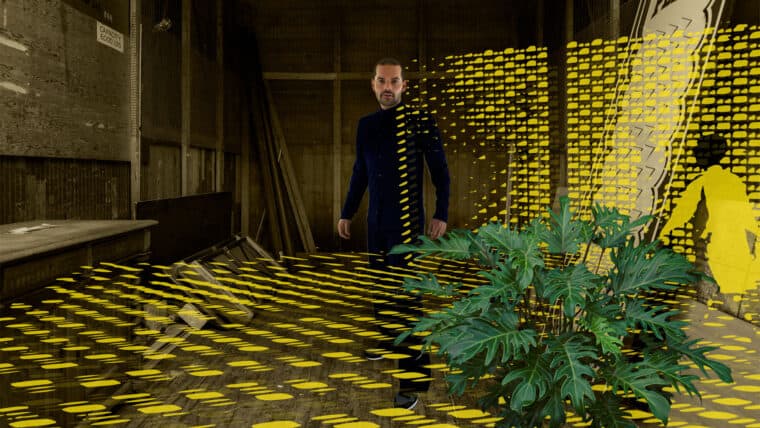
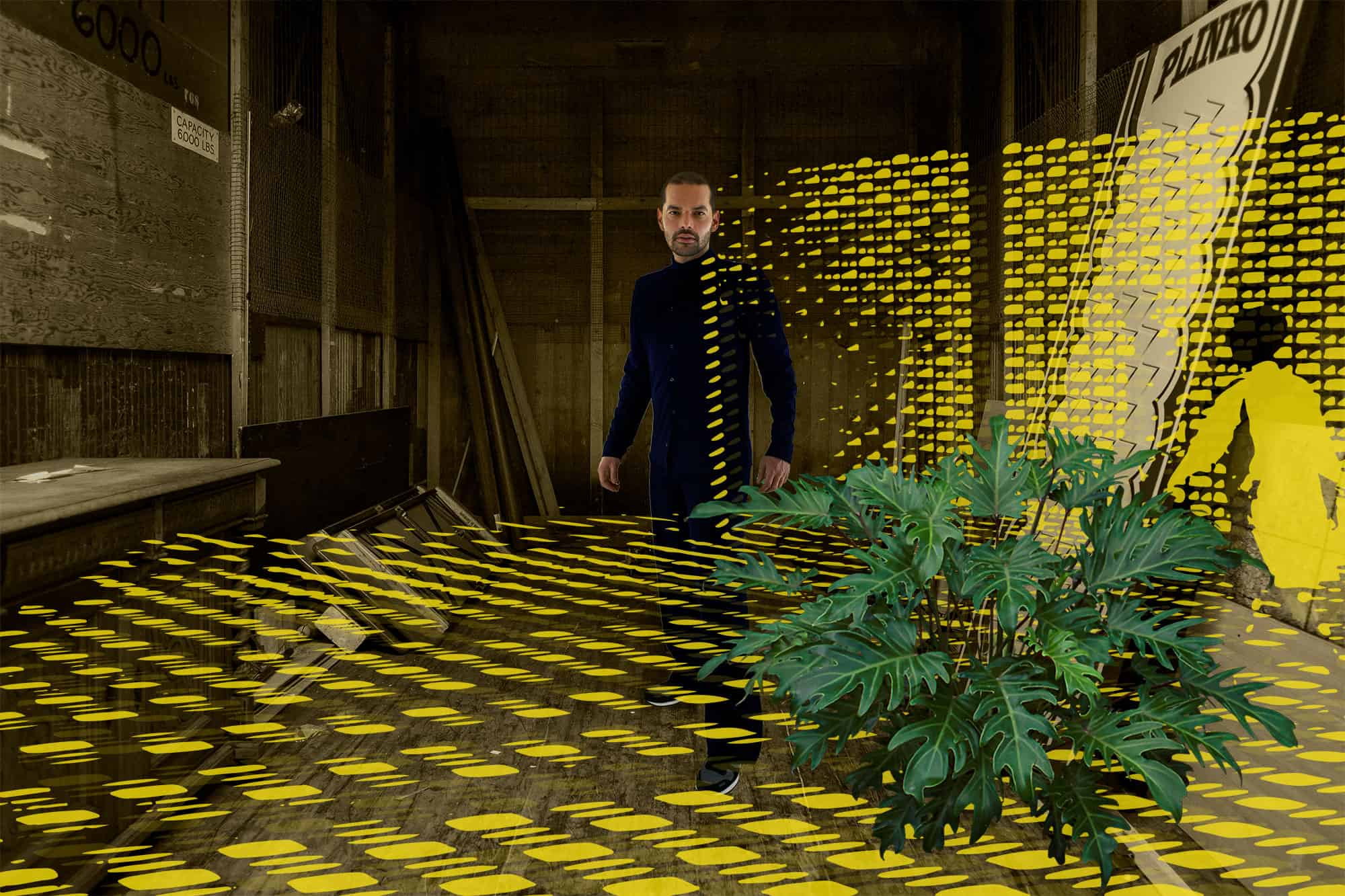
While telling us about some of the influences on his creative journey, Agrella gave us a quick tour of UCV, which he attended as an architecture student. He shared photographs of outdoor passageways edged by seemingly simple, perforated, cinderblock walls where the strong tropical sun passes through to create an astonishing play of light and shadow. Villanueva’s vision was that the walls would deliver a shifting environment for passersby. Agrella harvested the playful details created by the shadows as a jumping off point for his work.

In a small moment of happenstance, Agrella shared a portrait of Villanueva taken by a friend of mine—the celebrated Venezuelan photographer Paolo Gasparini. The photograph depicts the architect proudly standing in the concert hall he designed with Alexander Calder. What he didn’t show was a beautiful series of photographs Gasparini created decades earlier of the same shadow-and-light passageways at the university. I wrote to Agrella afterward to share the series, and of course he was familiar with them.

In some ways, we are still connected.

I ❤ NY

06/24/2015

For the love of logos

By Daniel Schmeichler

I ❤ NY

We’ve all read useful pointers that separate good logos from ones that miss the mark.

In general, a logo should be:

  • Distinctive
  • Simple
  • Adaptable

Doesn’t everybody love NY?

From a practical perspective, we also strive to create logos that are effective in black and white or color, with a focus on form. And, given the numerous channels where your logo might appear in this day and age, it’s even more important to keep in mind that logos should be truly scalable, from 16×16 pixels to the side of a building.

We love creating logos, especially for new companies who are seeking their first opportunity to make an impact on potential customers. Although we try to structure the process to be as straightforward as possible, in essence, we’re forming a partnership that will help us see into the heart of the company. That’s how we find out what your logo and messaging should communicate.

The process of discovery helps us gain critical insight into the business in order to understand what direction we should be going in. We ask questions around audience, objectives, personality, plans for growth to help characterize your company so we can see your vision for the future. We create brand guidelines to be a roadmap on our journey to visual identity.

It’s only after we know how you see yourself that we can envision how the rest of the world should first encounter your brand, through your logo. Is your brand speaking your message?