


Image by Emily Zheng
As a designer at 2A, I spend my days building everything from infographics and ebooks to solution briefs and pitch decks. No matter the format or audience, I lean on the same reliable foundation: good design principles. At 2A, we pride ourselves on combining strategic storytelling with smart design—and for me, that starts with a little C.R.A.P.
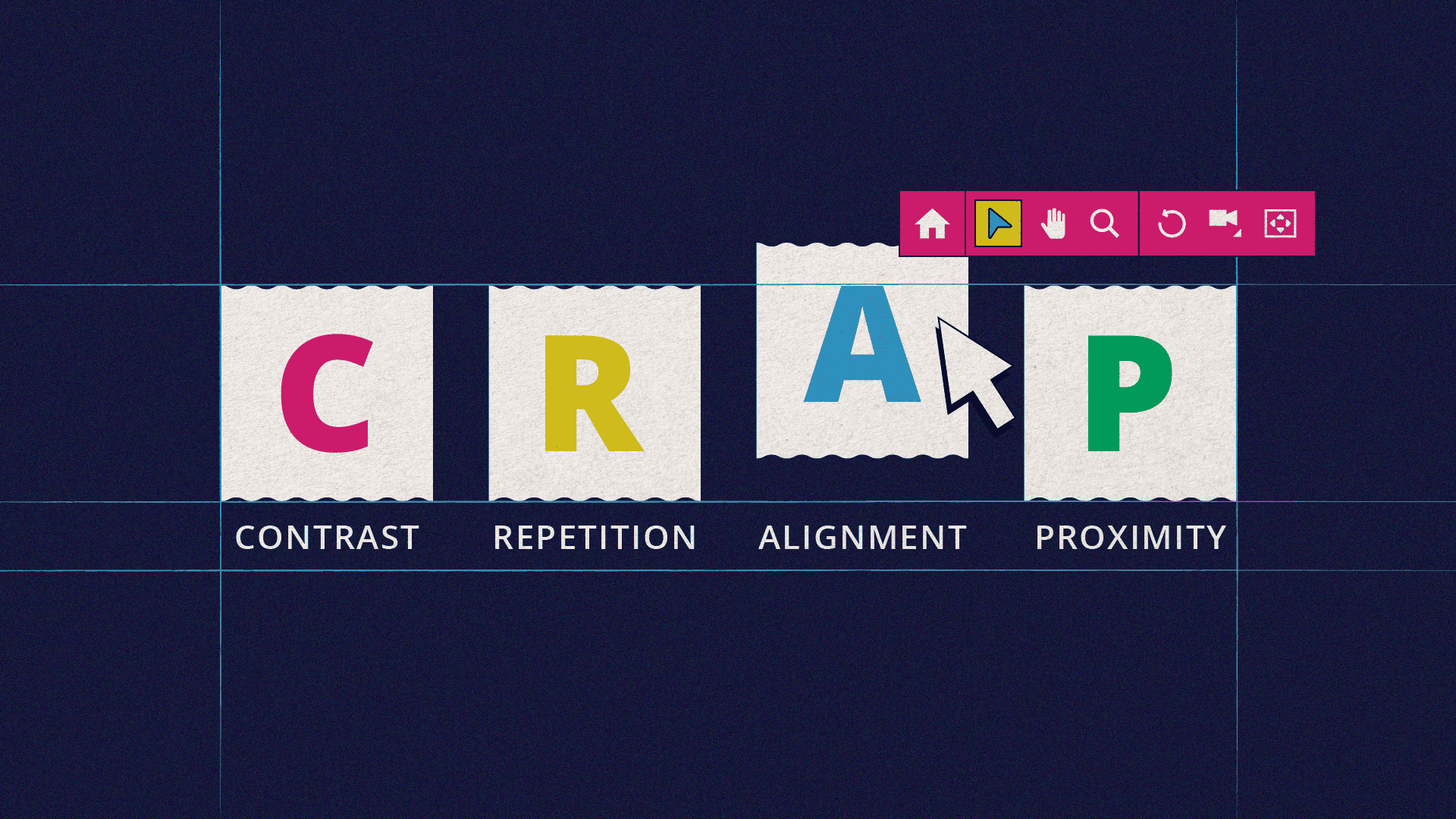
What is C.R.A.P.?
Contrast, repetition, alignment, and proximity—I approach every creative endeavor with this straightforward, four-principled framework that I learned on day one of college. Whether I’m starting from scratch on a Figma prototype or building a piece of furniture in my shop, I always seek a solution that adheres to these four basic principles.
Why is it foundational to everything I make?
“Design” is a robust word, but at its core, design is simply creating order out of chaos. And to get to a place of order, first there needs to be a set of rules to follow.
Contrast. People are inherently drawn to things with contrast. Contrast taps into a part of our brain that predates modern humans. It’s why hunters wear orange—to stand out against the backdrop of fellow hunters. Our brains seek out things that break patterns. In design, contrast is perhaps the most foundational of the rules, allowing us to create distinction between two things. Contrasting background colors help us create distinct sections of an infographic or callout box. High contrast is an important part of our efforts in creating accessibility.
Repetition. While contrast seeks to differentiate, repetition seeks to assimilate, creating readability that makes information easier to digest. In design, we create typographical systems and layouts that indicate what type of information the audience is about to receive before they’ve had the chance to absorb it. The audience knows they’re starting a new section because there is a repeating title style and layout. They know that a product is part of a larger ecosystem because of repeating brand elements.
Alignment. Remember a few sentences ago, when I said our brains seek out things that break patterns? Well, our brains also really like patterns. We like to know where to look and be able to anticipate what’s coming next. Most designers and copyeditors hate right-justified text for this reason. When reading right-justified copy written in English, the varying line lengths confuse our brains, as our eyes are accustomed to moving to the far left edge.
Proximity. How do things fit together, or in laypeople’s terms, does this information go with this information? Does this piece of the puzzle need to go with that piece, or can it be moved down a bit? Objects too close together? Designers love white space. I don’t know why so many people seem to have a desire to fill every spare inch with more stuff. Proximity is about finding balance. At 2A, we generally believe less is more.
C.R.A.P. is all around us.
The beauty of C.R.A.P. is that it scales out. You can apply this framework to any creative endeavor, like building a piece of furniture or preparing a meal for friends. It also scales up. Does this ebook contrast enough to create distinction from competitors with a similar product? Does it repeat established and familiar brand elements and solutions? Does it align with the messaging and creative brief? Where will it live and what proximity will it have to other assets? Each principle of C.R.A.P. on its own is only part of the process. And each part overlaps with every other part.
So—what type of C.R.A.P. are you making today? Need a fresh pair of eyes (and a sharp design mind) on your next creative project? At 2A, we apply the right amount of C.R.A.P. to every asset to make your brand stand out for all the right reasons. Let’s talk!