At 2A, a lot of our design efforts go into shaping presentations to tell a great story. We’re constantly pushing the limits of what’s doable in PowerPoint, striving to make presentations interesting and engaging rather than a bland slog through bullet points. Making them sing requires staying on the pulse of the latest trends. With a new year upon us, here are some hot design tips to make sure your presentations aren’t trapped in the past.
Sanding off the edges: removing the details from illustrations and icons
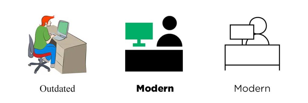
Screens are becoming capable of higher definition all the time—from Apple’s Retina to Microsoft’s ClearType to 4K TVs. But rather than cramming details into every pixel available, the savvy designer takes a simpler approach to the crisp clarity provided by high-res screens. Here’s what’s hot:
- Illustrations are headed toward one of two minimalistic paths: solid block colors or open outlines.
- Icons are becoming more abstracted rather than finely detailed.
- Similar graphic styles are used to communicate information; for instance, infographics are replacing charts, visualizations are superseding text.
Our advice? Embrace those designs. Viewers can only take in so much visual information, especially when it’s accompanied by a speaker. Cutting graphics down to the bare minimum will make sure audiences take notice of what you want to emphasize. Gain a little pop by combining text and minimalistic graphics to concisely communicate information.

CAN YOU HEAR ME NOW‽ Typography is getting bold with all caps
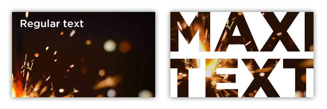
Maxi typography, which uses all caps and often dominates the page, is a growing trend in design. Look for:
- Bold, all-caps, sans-serif fonts that serve as the hero and emphasize titles and text.
- Full bleed layouts as the backdrop for maxi typography, making the text jump off the page and immerse the viewer.
- Larger text means that photographs and texture can be placed inside typography to draw the eye.

As we like to say, “less is more work.” Like streamlined icons, just because something is simplified does not necessarily make it easier! Careful planning will go a long way toward helping your text make its greatest impact. Get ready for some louder typography in 2020—your words are going to make a statement.
It’s morphin’ time: PowerPoint threads the story with motion
First introduced several years ago, PowerPoint’s Morph transition is gaining a foothold as presenters realize its full potential. You’ll see more of Morph in 2020 because it provides an incredibly easy way to add elegant visual transitions. Here’s what you need to know:
- Instead of spending hours assembling complex animations, Morph allows you to naturally and easily revise motion as you design in PowerPoint.
- Morph or Fade can work wonders to flow content between slides, smoothly guiding viewers through your story.
- Animation and transitions in PowerPoint are extra effective when combined with the graphic and text treatments discussed above.
As we move into a new decade, it’s exciting to see how presentation methods continue to grow and evolve. Let’s leave the days of “death by PowerPoint” behind and forge dynamic new presentations!

