Blog

Mitchell Thompson

Mitch can talk the computer talk. He enjoys chatting in code to make websites shine and connect to users. Faced with a web design curveball, he’ll catch it with his sharp know-how and strong Google fu.

Fullstack Developer | LinkedIn
Be present, think lateral with Oblique Strategies

11/19/2020

Be present, think lateral with Oblique Strategies

By Mitchell Thompson

Be present, think lateral with Oblique Strategies

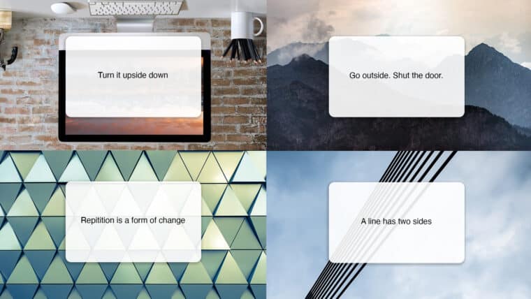
Ask your body. Turn it upside down. Do something boring.

We’ve all heard of thinking outside of the box, but how do you really do it? Famed non-musician Brian Eno and multimedia artist Peter Schmidt developed a unique approach called Oblique Strategies to break through creative barriers. Oblique Strategies is a deck of cards with short phrases meant to introduce constraints or reframe the problem at hand and encourage lateral thinking. Prompts like Ask your body and Turn it upside down help kickstart creativity with somewhat removed and roundabout thoughts.

This year has presented us with a plethora of new challenges to overcome, and it’s obvious that our old way of doing things isn’t cutting it. Curiously enough, the Oblique Strategies hinting at mindfulness have been surprisingly helpful for me lately. I’ve been questioning if I’ve made good use of the time I’ve gotten back from the disappearance of things like commutes and recreational shopping. Strategies like Do nothing for as long as possible and Remember the quiet evenings have a meditative quality and are grounded in gratitude. We’re often so driven by our goals that the pleasure of the moment is lost in the desire to get somewhere as quickly as possible.

There are no correct ways to apply Oblique Strategies. The journey is the destination—lateral thinking puts us in a place to see and understand more. Perhaps the ultimate secret is to stay mindful of where we are and what’s right in front of us. Here are three examples of how to interpret Oblique Strategies to stay in the moment while overcoming obstacles.

Embrace the constraints

A line has two sides. Instead of trying to see through something, look around it. Accept the boundaries you have to work with (like time, medium, or purpose) and spend your time exploring the open space that exists around them. That doesn’t mean accepting things at face value, but truly understanding the box that you’re trying to think outside of. Constraints present a structure, and once we acknowledge the structure, we can begin to create ways to use it in our favor.

Practice the failure bow

What mistakes did you make last time. We’re fallible. To deny that is to deny room for growth. Not all strategies will lead directly to the end goal (they shouldn’t, really), but gracefully accepting failure and letting it flow through allows us to get one step closer to true success. If we look closely at the most embarrassing details and amplify them we are welcoming the opportunity to learn from mistakes and cultivating a culture with less ego. In essence, failure is far more powerful for learning than engineering a string of successes—so celebrate those moments!

Unlearn what you’ve been taught

Discover the recipes you are using and abandon them. Many of the processes we’ve learned were developed for a different time and place, so it’s more important than ever to truly step away from the orthodoxy. When time is of the essence this can be a challenge, but prioritize the idea and allow yourself a moment to view something with a child’s eyes and entertain the ridiculous or unexpected.

No matter what you do, accepting what cannot be changed, welcoming failure, and not being afraid to let go will enable out-of-the-box thinking. But maybe more importantly, just Go outside. Shut the door. And Breathe more deeply.

PowerPoint crystal ball

01/08/2020

A 2020 vision for presentations

By Mitchell Thompson

PowerPoint crystal ball

At 2A, a lot of our design efforts go into shaping presentations to tell a great story. We’re constantly pushing the limits of what’s doable in PowerPoint, striving to make presentations interesting and engaging rather than a bland slog through bullet points. Making them sing requires staying on the pulse of the latest trends. With a new year upon us, here are some hot design tips to make sure your presentations aren’t trapped in the past.

Sanding off the edges: removing the details from illustrations and icons

Screens are becoming capable of higher definition all the time—from Apple’s Retina to Microsoft’s ClearType to 4K TVs. But rather than cramming details into every pixel available, the savvy designer takes a simpler approach to the crisp clarity provided by high-res screens. Here’s what’s hot:

  • Illustrations are headed toward one of two minimalistic paths: solid block colors or open outlines.
  • Icons are becoming more abstracted rather than finely detailed.
  • Similar graphic styles are used to communicate information; for instance, infographics are replacing charts, visualizations are superseding text.

Our advice? Embrace those designs. Viewers can only take in so much visual information, especially when it’s accompanied by a speaker. Cutting graphics down to the bare minimum will make sure audiences take notice of what you want to emphasize. Gain a little pop by combining text and minimalistic graphics to concisely communicate information.

Outdated vs Modern icon styles

CAN YOU HEAR ME NOW‽ Typography is getting bold with all caps

Maxi typography, which uses all caps and often dominates the page, is a growing trend in design. Look for:

  • Bold, all-caps, sans-serif fonts that serve as the hero and emphasize titles and text.
  • Full bleed layouts as the backdrop for maxi typography, making the text jump off the page and immerse the viewer.
  • Larger text means that photographs and texture can be placed inside typography to draw the eye.

Regular text vs Maxi text

As we like to say, “less is more work.” Like streamlined icons, just because something is simplified does not necessarily make it easier! Careful planning will go a long way toward helping your text make its greatest impact. Get ready for some louder typography in 2020—your words are going to make a statement.

It’s morphin’ time: PowerPoint threads the story with motion

First introduced several years ago, PowerPoint’s Morph transition is gaining a foothold as presenters realize its full potential. You’ll see more of Morph in 2020 because it provides an incredibly easy way to add elegant visual transitions. Here’s what you need to know:

  • Instead of spending hours assembling complex animations, Morph allows you to naturally and easily revise motion as you design in PowerPoint.
  • Morph or Fade can work wonders to flow content between slides, smoothly guiding viewers through your story.
  • Animation and transitions in PowerPoint are extra effective when combined with the graphic and text treatments discussed above.


As we move into a new decade, it’s exciting to see how presentation methods continue to grow and evolve. Let’s leave the days of “death by PowerPoint” behind and forge dynamic new presentations!

Synthwave

01/30/2019

Synthwave—nostalgia for a past that never existed

By Mitchell Thompson

Synthwave

A few weeks ago, I went to see The Midnight perform at Neumos. I discovered their music fairly recently, but they’ve swiftly become one of my favorite bands for how their melodies and vocals carry such a strong feeling of emotion, longing, and ennui. As saxophone solos wafted over a crowd illuminated in beams of neon light, I could hardly imagine a better visualization of the burgeoning synthwave movement.

Synthwave, also called retrowave or outrun, is an artistic movement that’s been gaining a lot of steam over the past several years. Inspired mainly by imagery and music from the 80s, synthwave combines visuals like neon lighting, airbrushed chrome, computer grids, and midnight cityscapes with synthesizer-heavy music reminiscent of new-wave pop music and sci-fi movie soundtracks. The genre explores a wide variety of themes, from retrofuturistic optimism to dystopian fears of mechanized oppression. Many artists explore the limits of 80s media, intentionally adding VHS noise to digital video or releasing their music on vinyl.

And yet, for something apparently steeped in nostalgia, synthwave isn’t an accurate representation of what the 80s were really like. Movies looked at as progenitors of the movement—such as Blade Runner, TRON, or films by John Carpenter—were minor successes at best or box-office failures at worst. Synthesizer film scores by Tangerine Dream and Ennio Morricone garnered Razzie nominations rather than Oscar nods. Even the famous DeLorean DMC-12 seen in Back to the Future drove poorly and sold worse. Though synthwave visuals may resemble tech support posters or a Corvette ad, by and large the media of the 80s bore only a minor resemblance to this new aesthetic. Going beyond regular rose-tinted glasses, synthwave is nostalgia for a time that never existed.

This fascinating development—faux-nostalgia taken in a new and modern direction—speaks to me as a designer. A truly successful design should connect with its audience, and synthwave has achieved this. Straightforward 80s nostalgia has become a huge marketing trend in recent years, from Voltron selling Hondas to the Stranger Things kids suiting up as Ghostbusters, but synthwave goes beyond simply parroting what was popular 30 years ago. Instead, the movement uses a smaller-scale evocation of certain nostalgic elements rather than a full-on resurrection.

In an age where you can instantly stream a classic album or pull up clips from a favorite movie, synthwave stands out by sampling the mood and aesthetics of the past and then taking it in a new direction. Pressing beyond hollowly echoing nostalgia, synthwave finds a unique way to create emotionally resonant works.

decorative image

04/19/2018

The Pros of Cons: Good vibes from Seattle’s comic cons

By Mitchell Thompson

decorative image

Conventions are an important channel for many businesses, and we’ve certainly contributed to these huge events by building keynotes. But there’s another, much more fun side to conventions—the comic con! You’ve probably heard of the massive San Diego Comic Con, but there are hundreds of similar conventions around the world. This year I attended two Seattle conventions, Emerald City Comic Con (ECCC) and Sakura‑Con.

Drawn to con

Each convention has a different focus that draws different crowds. Despite the eponymous focus on comics, ECCC has a more general pop-culture tilt, encompassing TV shows, movies, books, video games and more.
Sakura refers to the blossoms of Japanese cherry trees (seen locally in such places as the UW quad), referencing its narrower lens on Japanese media.
Whatever their focus, the positive energy and enthusiasm on convention show floors is contagious.

It’s official

From miles of comic-book-back-issue longboxes to hard-to-find DVDs, to vintage action figures, there’s no end to what’s available on the floor. At Comic Con, I love to get my comics signed by the authors and artists who worked on them—it’s a fun physical collectible I can keep. Plus, getting to hear behind-the-scenes anecdotes deepens my appreciation for the craft. Some cons even invite celebrities. This year I took a photo with Christopher Lloyd and the DeLorean time machine.

Meet and greet

On the crowded convention floor the main activity is interacting with others. These people are dedicated—willing to travel from hundreds of miles away to take part in the experience and meet like-minded fans.

You may have heard of cosplay—a fancy term for dressing up as a character from something you love. As Adam Savage eloquently put it in his TED talk, cosplay is where we are “injecting ourselves into a narrative that meant something to us.” It’s a physical, personal embodiment of what you enjoy. I may not know many people in my day-to-day life who enjoy JoJo’s Bizarre Adventure, but when I dress up as a character from the series I can quickly find fellow fans. Cosplay has even led me to friendships that continue long after the con runs its course.


Fan conventions are a wonderful celebration of all the things I enjoy. Attending Seattle’s conventions were one of the highlights of my year, and I’m already coming up with ideas for next year.

Social Media - where, when, why, what

10/05/2016

When to get social: A cheat sheet

By Mitchell Thompson

Social Media - where, when, why, what

With any business engaging your target audience is crucial to your success and many companies turn to their social channels to get the job done. After all, it allows us access to thousands of people all over the world from the comfort of our couch. However, social media can be daunting to keep up with due to its ever evolving nature and the growing number of platforms out there. Prioritization is key to maximizing your resources and efforts.

Social Media Chart
Click to view full size

Have you been getting the most out of your social?

PC Building instructions

06/01/2016

PC Building

By Mitchell Thompson

PC Building instructions

A few months ago, I was in the market for a new computer. I was ready to move on from an older laptop to something with a little more power for all my gaming, editing, and rendering. Since I use my computer so often, I wanted to make sure I had one that really met my needs. I was going to build a new computer!

But why build a computer? Although I could probably find a computer online or off the shelf that would work out fine, the two big reasons I was looking to build my own were price and precision. Building my own computer ended up saving me hundreds, and because I customized each facet of it I was certain that all the parts would meet my needs. Plus, I was able to leverage past CS classes as I planned out the build. From knowing the difference between data memory and data storage to terms like POST, all those hours spent studying were finally paying off.

Because I was making such a big investment of time and money, I figured it would really pay off to do my research and get advice from people who had more experience than me. I posted on forums, consulted sites like PC Part Picker, watched tutorial videos, and spoke with experienced friends. I also looked for sales and rebates to make sure I could save money wherever possible – I even ended up cancelling an order that was about to ship because I found a slightly better deal elsewhere!

Once everything had arrived and I started the build, I found that putting all those expensive parts carefully into the case wasn’t as big of a hassle as I had expected. One friend had reassuringly described it to me as no harder than “putting together a LEGO set”, and he wasn’t too far off. Each part came with instructions of where and how to connect them, with each cable and slot clearly labeled. After several hours of steady hands and careful connections, it was an amazing feeling when I was finally able to hit the power button and watch it boot up.

PC

I’ve been using my new computer for several months now, and so far it’s been excellent. Games I could barely run on my old machine I can now turn up to maximum settings with ease. Videos play and render far more smoothly. But the best part is that I can take pride in having researched, planned, and built something that is uniquely mine.

At the 2A office, there have been sounds of construction as we expand and rearrange our office space. It’s an exciting time of transition as we continue building and advancing our unique consulting business. Just like the parts in a computer, the members of our close-knit team all play a part in shaping the course of the business. And like building a computer, the process of getting there can be a lot of fun too.

Make it look like something

05/05/2016

Make it look like something

By Mitchell Thompson

Make it look like something

Previously, we looked at a few ways to make your presentations not suck. How do you make sure a presentation truly stands out? The design approach can make or break a presentation. In our experience, the following seven design tips are invaluable.

  1. Make it look like something – Create a unified visual experience
    A bit of intentionality can go a long way in helping your presentation stand out.
  2. Keep it clean and simple Show main points, not fine details
    Limit content to the big ideas and embrace empty space.
  3. Limit color choices – Use contrast for emphasis
    Use a reduced palette for graphics, text and backgrounds. Consistency and simplicity in your color palette will help your audience easily navigate the presentation.
  4. Limit fonts Ensure fonts are complementary and related
    Choose one font family for your presentation and create hierarchy by using different weights and sizes.
  5. Support with imagery – Use images, not lists
    You’ve heard it before: a picture is worth a thousand words. Where possible, try and buck the bullet list impulse and use more slides with key points. A well-chosen image with minimal text will make your story more impactful.
  6. Think depth and flow – Use varying styles to reinforce pace and structure
    Adjust the slide design to fit the content: title slides, diagrams, and deep dives. Using color to mark sections is a great way to reinforce your presentation’s structure.
  7. Review with fresh eyes – Go over the entire show before presenting
    Use the slide sorter to get a feel for the flow of your presentation. Is it clear when there is a transition to a new section? Do the slides deliver a consistent experience?

As it turns out, looks do matter in the world of presentations. Make an investment in developing a well-designed presentation, and watch it pay off.