Is your AI messaging as good as your product? 

01/07/2026

Is your AI messaging as good as your product? 

By Olivia Witt, Carolyn Lange

Is your AI messaging as good as your product? 

Image by Emily Zheng

AI is supposed to be the most exciting thing happening in tech right now. It’s powerful, it’s fascinating, and it’s reinventing entire categories of work. But you wouldn’t know it by reading most AI product websites.

Somehow, the world’s most thrilling technology keeps getting distilled into phrases like “streamline processes” and “unlock the value of your data.” You’d think AI was invented solely to help overworked managers feel slightly better about their operational dashboards.  
 
Let’s look at where AI messaging goes flat, how to spot the signs in your own copy, and how to get on the path to clearer differentiation. 

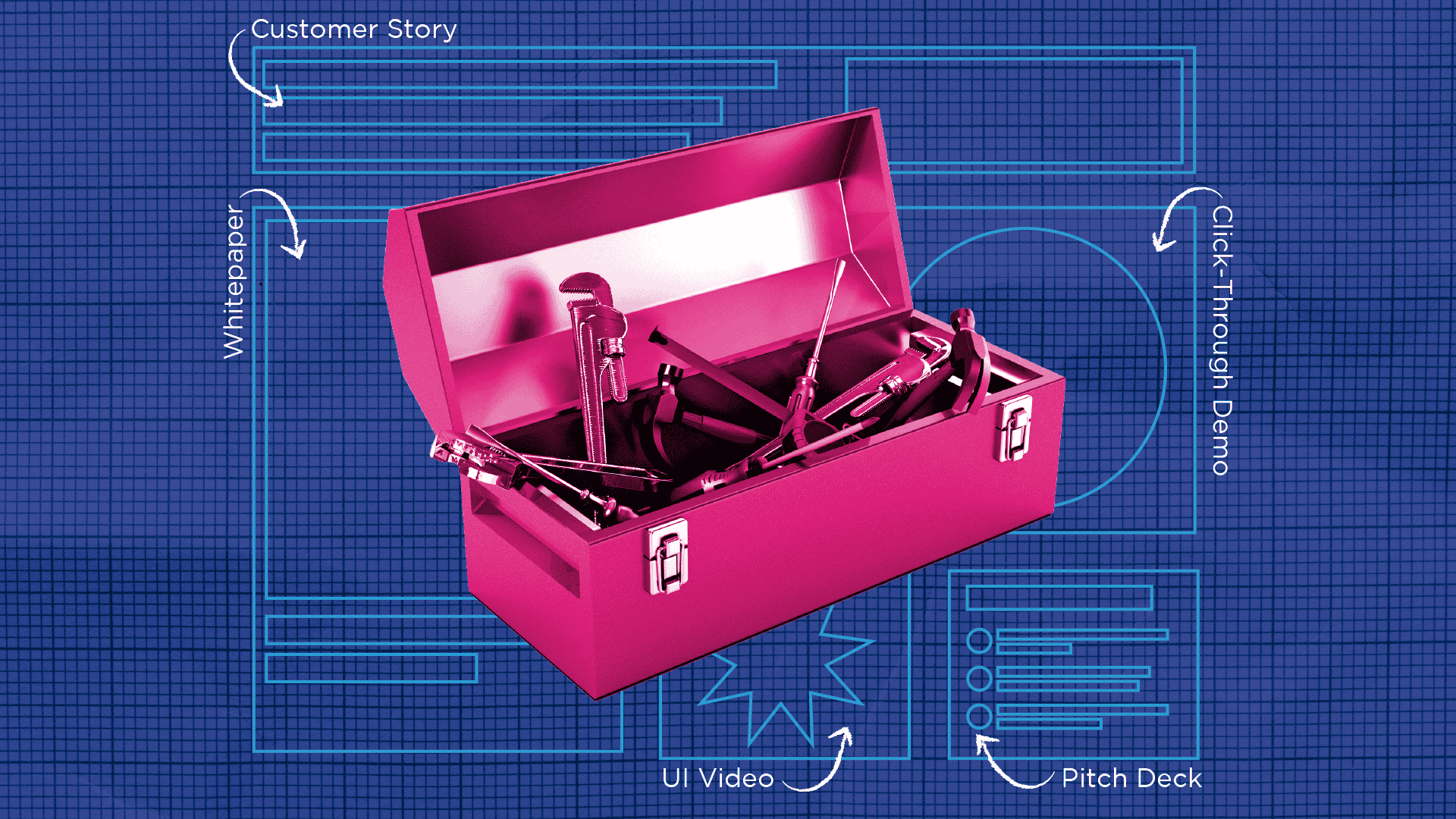
This messaging could belong to any AI tool 

To show what this looks like in the real world, here’s the kind of messaging you’ll find across half the AI work automation market. 

Tempo is an AI-powered work automation platform that streamlines your processes from end-to-end using predictive intelligence. By eliminating manual, repetitive tasks and reducing bottlenecks across the organization, Tempo helps boost operational efficiency at scale. With automation guiding every step, your business is better equipped to adapt, grow, and stay future-ready.

It works. But it’s also extremely forgettable. And the kicker is: the product underneath is actually very cool. So, let’s make the messaging match the substance. 

Tempo is an AI-powered work automation platform built to understand the behind-the-scenes of your business. It finds the places where things slow down—handoffs that stall, steps that repeat, patterns everyone follows but no one really questions. As Tempo learns your team’s natural rhythms, it automates the friction that causes the most drag and surfaces smarter ways to move work forward. Your workflows get faster on their own, without needing a big redesign.

Suddenly the product feels more grounded and more memorable. It’s something built for people instead of presentations. 

So what happened here? 

The new messaging works because… 

  • It trades aspiration for specificity. “Streamline your processes” could describe any automation tool. “Tempo learns where work actually stalls and fixes those patterns first” tells you something real about the tool and the AI behind it.
  • The benefits don’t just restate the features. The old version promises efficiency because… automation. The new version shows the outcome: fewer hidden slowdowns, smoother handoffs, faster work.
  • It explains how the product delivers value in real-world terms. Generic AI messaging says “intelligent automation” and moves on. The revised copy makes Tempo’s approach clear: it learns real behavior, uncovers real bottlenecks, and improves actual workflows without redesigning them.

Self-assessment: Is your AI messaging putting people to sleep? 

Time for a quick self-assessment.  

  1. Could a competitor paste your messaging onto their site without changing a word?
  2. Does your hero line rely on broad promises instead of describing something real or observable? 
  3. Do your benefits sound like synonyms for “work faster” or “do more with less”? 
  4. Is your copy missing real-world context your audience would recognize? 
  5. Do your benefits restate your features in slightly different words? 
  6. Could a non-AI tool make the same claims you’re making? 
  7. Would your messaging read almost the same if you swapped “AI” with “software”? 

Scoring 

Mostly yes: Your messaging is technically correct, but easy to forget. If you’re ready for clearer, more differentiated language, 2A can help you build messaging that actually sounds like you. 

Mostly no: You’re carving out your own space in a crowded category. If you want to turn that clarity into standout content or a full narrative, we’d love to help you take it further. 
 
Let’s build something better together > 

The engine that makes Google Cloud’s customer stories more human

12/16/2025

The engine that makes Google Cloud’s customer stories more human

By Carolyn Lange

The engine that makes Google Cloud’s customer stories more human

Image by Rachel Adams

If you work in marketing, you’ve probably noticed that customer stories tend to follow a familiar pattern. Useful, sure, but not always the most compelling way to show what a team actually built or why it matters. 

Over the last year, we’ve built an internal engine with our Google Cloud partners that helps us tell these stories differently. Instead of only dropping customers into a problem, solution, results template (which has its time and place), we start with richer inputs, dig deeper for voice and nuance, and craft pieces that read more like real conversations.

Starting strong with thoughtful inputs 

One thing we love about working with our Google Cloud clients is the way they encourage their customers to be thorough in our intake form. Product marketing managers and account teams take the time to set expectations and give customers space to answer thoughtfully. That means we often start with: 

We don’t need every diagram or service dependency to write a strong story… but having them helps us choose the right details. Better too much information than too little when you’re translating something like a migration to Cloud Run or Target’s use of AlloyDB AI into a narrative anyone can follow. 

Digging deeper, however the customer works best 

Our discovery process is intentionally flexible. Sometimes we hop on a Google Meet with the customer and ask follow-up questions live. Other times, everything happens asynchronously in doc comments, letting people think before they answer. This mix of structured inputs and flexible follow-up gives customers the space to be thoughtful and selective in what they share. It also lets us meet them exactly where they work best, something that feels especially natural in our Google partnerships. 

When we do meet, we listen for how Google’s customers talk about their project: what they emphasize, what they gloss over, and what sounds too exciting to ignore (like Google’s AI Hypercomputer). That’s where their voice lives and what makes each story unique. 

Writing from their perspective 

This is where the magic happens. Instead of locking ourselves into the classic case-study phrasing, we write many of our dev-centric stories the way the customer would actually tell it.

For example, a traditional case study might say: 

“The team migrated its workloads to GKE to improve scalability.” 

But the customer would say: 

“We moved our workloads to GKE so we could scale without babysitting infrastructure.” 

A scrappy startup modernizing on GKE sounds nothing like a research team building a GenAI pipeline with Gemini. That’s why we let each piece find its own rhythm. And because Google encourages a more human, conversational tone, we’re able to keep the writing lively, even when we’re deep in architecture decisions or GenAI pipelines. Their stories can be technical and still feel witty, warm, and unmistakably human. 

Process makes perfect 

A huge part of why this works is project management on our end (shout out to Google Cloud process expert Sal) and on Google’s. Internally, we keep the machine humming by coordinating schedules, tracking templates, meeting with the client, managing approvals, and quietly removing roadblocks before anyone notices them. 

And we couldn’t do any of it without our Google Cloud partner marketing managers. They know their customers and products inside out, and they give us the right context and guidance to make each story shine.  

At its core, the success of our Google Cloud customer story engine comes down to four things: 

  1. Thorough inputs that help us understand the full scope of the story 
  2. Flexible discovery that pulls out authentic voice 
  3. Perspective-driven writing that feels human 
  4. PM support from 2A and Google that keeps the process delightfully uneventful 

If you want stories that feel like real humans talking about real wins, this is how we get there. 

Let’s make your next customer story feel more human → 

Illustration of a video player with a large play button on screen. A cursor points to a red ‘REC’ button. Icons for sharing, user profile, film clips, and a heart reaction appear around the player, symbolizing recording and sharing video content.

09/23/2025

The case for remote video case studies

By Carolyn Lange, Erin McCaul, Felip Ballesteros

Illustration of a video player with a large play button on screen. A cursor points to a red ‘REC’ button. Icons for sharing, user profile, film clips, and a heart reaction appear around the player, symbolizing recording and sharing video content.

Image by Nicole Todd

For some folks, the concept of remote video case studies conjures early-pandemic memories of pixelated webcams and talking heads in spare bedrooms. But today’s remote videos are a different story. With planning, direction, and editing, they can look sharp, feel personal, and bring customer voices forward in a way that matches the channels people actually use.

Think of them as the right tool for the right job. You wouldn’t hire a film crew to record a podcast snippet, and you wouldn’t use a remote video for a keynote opener. Each format has its place. And for authentic stories that need to move fast and travel far, remote is built for the moment. Here’s why:

More reach for your story 

A customer win captured in video gets more traction than one tucked inside a PDF. Remote videos extend the life of your written case studies, with attention-grabbing snippets for social or the ability to embed in campaign pages.

Polished, not overproduced 

Remote video delivers professional quality without the need for a studio. What you get is storytelling that feels approachable and credible. It’s exactly the tone most audiences expect in their social feeds today—casual enough to fit in amongst a sea of workplace hot takes, and polished enough to shine.

Easier to get the right voices 

Coordinating travel and multi-day schedules for leaders or customers can stall a story for months. Remote recording removes those barriers, so you can include folks across time zones without disrupting the workday. The result is a broader set of voices and perspectives, captured without logistical headaches. 

More value for time and budget 

Remote production eliminates airfare, hotels, and days away from the office. Instead of tying up resources, you get high-quality storytelling that respects people’s time and saves budget, leaving more room for additional campaigns or assets.

Faster campaign turnaround 

Without the need for location scouting or pre-production setup, remote videos move from idea to final cut quickly. That speed means your content can keep pace with campaign timelines and market moments while they’re still relevant.

Flexible and evergreen 

Case study video doesn’t have to be one-and-done. Remote formats make it simple to refresh graphics, swap in updated B-roll, or adjust messaging without a full reshoot.

It’s time to revisit remote

It’s a smart, polished way to amplify customer voices fast, authentically, and in the formats people are actually consuming.

Our remote video team—writers, editors, designers, and videographers included—makes “remote” look anything but DIY. Ready to roll? Let’s talk

Collage-style illustration of a computer window with a green grid background, a large blue location pin in the center, and a hand placing it. Surrounding elements include design icons like a text size 'Aa' box, color palette, toggle switch, image placeholder, and interface buttons, representing digital design and navigation

08/13/2025

Navigating design: How we stick to a brand with or without guidelines 

By Suzanne Calkins, Carolyn Lange

Collage-style illustration of a computer window with a green grid background, a large blue location pin in the center, and a hand placing it. Surrounding elements include design icons like a text size 'Aa' box, color palette, toggle switch, image placeholder, and interface buttons, representing digital design and navigation

Image by Nicole Todd

This year has brought a steady stream of new-to-us brands, each with its own style, assets, and way of working. And just like any new adventure, we weren’t quite sure what was in store for us when we set out. Some of these new projects kicked off at the trailhead with just a color palette and a deadline, while others were already at the final mile—sharing polished brand systems and guidelines. We found ways to adapt to both, drawing on our experience as creative problem-solvers and collaborators to guide each project to a strong, on-brand finish.  

Whether we’re following a well-worn map or forging ahead on what years of expertise tells us, we’ve learned a few things about how to navigate the process.  

Under-developed design toolkits: When we kick things off with a new brand, we typically ask for a design onboarding session where our designers can review available references and identify areas that need clarification. If brand guidelines are light, we’ll look for clues in the wild—published assets, LinkedIn posts, or campaign examples that hint at their intended direction. From there, we guide the conversation: What tone are you hoping to strike? What visual details do you love (or hate)? When the client isn’t sure yet, our designers draw on years of experience and pattern recognition to offer strong starting points and explore multiple options. We help clients see what they want, often before they know how to ask for it. 

Well-established design guidelines: On the flip side, when brands have comprehensive toolkits we carve out extra time to go through all available resources. We also ask early on if there needs to be a brand review process, then build that step into our timelines.  

And now the fun part! Here’s a snapshot of what we’ve been up to recently: 

Neo4j  

We riffed in real time, tested a bolder color palette, and reshaped social posts and decks for more punch. Consistent client collaboration kept the work fresh and cohesive across every asset. 

Google

We drew inspiration from a file-folder motif and ran with it. It served as the basis for navigating a 70+ page document.  

Auth0 (Okta)

We worked closely with available references and brand cues to shape a visual direction that respected identities of both Auth0 and the larger Okta family. 

Carrier

An in-progress Figma from the Carrier brand team became the blueprint for our Lynx design.  

Contact our team to speak with a consultant and see more examples of our designs in the wild. 

A stylized collage showing a person holding an envelope while a large, digital email notification overlays the scene. The email preview features a blue box with the text

07/17/2025

The anatomy of a high-performing email send 

By Carolyn Lange

A stylized collage showing a person holding an envelope while a large, digital email notification overlays the scene. The email preview features a blue box with the text
The anatomy of a high-performing email send 

Remember those chain emails from the early aughts? They were like tiny inbox surprises wrapped in weird promises like, “Forward this to 10 people or you’ll be cursed with lice forever,” or “Send this and your crush will take you to Burger King.” Some were absurd, some were oddly sweet, and the best ones had just enough charm to make me hit forward (for kicks and giggles). 

Eventually, though, the chain letters lost their magic. I tuned out when the messages didn’t change and that sense of connection I felt with the sender was lost. 

That’s what happens when your marketing emails start sounding the same. They become noise. At 2A, we treat each send like a fresh chance to connect, with clear, focused content that’s just different enough to earn a click. 

One recent email earned a 47% open rate and 25% click rate—well above peer benchmarks of 30% and 4%. Here’s what made it land so well. 

Nail the first impression 

This subject line is conversational, but not chatty. It introduces tension without sounding dramatic, and it sidesteps all the usual buzzwords that scream “marketing email.” 

We also use preview text that sets expectations and suggests that something helpful is waiting inside: “Tips to get partner content back on track.” 

Catch those eyes 

This collage-style design gives the email a distinct look without overwhelming the content. The combination of motion, color, and texture shows that we care about the details.  

Make it worth their time 

Got a tangle of partner or industry marketing content that’s hard to manage? It can quickly spiral out of control when teams repurpose the message without a clear strategy.   

Learn how to tame your messaging Hydra and build scalable assets that actually work. 


Right out of the gate, the email content names the problem. It acknowledges the reader’s reality with clarity and zero condescension. It also offers a clear, actionable promise without overselling. The brevity makes it feel more like a helpful nudge than a pitch, and the line about taming a messaging Hydra adds just the right bit of fun personality. 

Get the click 

The CTA closes the loop on the message by pointing to an outcome the reader can expect by clicking, instead of an offer. It’s visually bold and verbally simple. 

Optimize for your audience  

Our audience list is a living thing. We’ve spent years honing it, curating a group that’s relevant, engaged, and genuinely interested in what we send. We maintain it regularly and filter out bots to ensure our performance data reflects real human behavior. We even use an AI spam checker to find language that might be flagged by the filters. 

This email worked because it felt real. It had a point. It respected the reader’s time. And even though it resonated especially well with partner marketers, it was designed to connect with anyone dealing with messy content. 

Not every audience will respond to the same tone, format, or pacing. But the principle holds: if your email feels like it could’ve been written for anyone, it probably won’t matter to anyone. 

Say something specific. Sound like someone. That’s the bar worth meeting. And if your email sends could use a little extra spark, let’s talk

Illustration of a browser window filled with blue and pink lines of text. A hand holding a pencil circles a red phrase, while other editing marks and a magnified word “Leverage” suggest a review or revision process. The background is dark blue with floating squares and cutout paper textures, evoking a theme of AI-generated content review.

07/01/2025

Human vs. AI: How to know if your writing has a pulse 

By Ashley JoEtta, Carolyn Lange

Illustration of a browser window filled with blue and pink lines of text. A hand holding a pencil circles a red phrase, while other editing marks and a magnified word “Leverage” suggest a review or revision process. The background is dark blue with floating squares and cutout paper textures, evoking a theme of AI-generated content review.

Image by Nicole Todd

You know the feeling.  

The writing checks all the boxes. Grammar? Fine. Structure? Present. But you’re three paragraphs in, and nothing’s landed. You’re not bored, exactly. Just…disconnected. We get it. AI-generated content can feel like the industry equivalent of a knockoff handbag: technically correct but missing the soul. In a sea of auto-generated sameness, people are craving content that sounds like it came from someone who gets them.  

That doesn’t mean swearing off AI. It means using it well and knowing how to add the human layer that keeps readers reading. 

At 2A, we don’t fear the tech—we use it. Joyfully and strategically. It helps us write faster and get out of our own heads. But we never let it replace the part that matters most: knowing our audience, holding your brand voice, and shaping a story with a bit of soul. 

When humans and AI work in harmony… 

You can feel it. When someone’s really shaped an idea and turned it over in their minds, it leaves a trace of intention, texture, and warmth. (Yes, B2B tech can have cozy stories.)  

Here’s what that might look like: 

  • A point of view. There’s a pulse behind the prose. Real people have opinions. Great content does, too. 
  • Intentional rhythm. Sentences vary in length and cadence, so content reads naturally. 
  • Tone that fits the brand. It doesn’t just say the right things. It sounds like you. (Our tone? Smart, clear, and a little bit spicy.)
  • Specificity. The messaging is grounded in real-world examples, offers concrete advice, or speaks from personal experience with a turn of phrase you can’t just copy and paste. 
  • A sense of story. Even in B2B content, a good narrative structure pulls you through by giving you a reason to keep reading.
  • Quotes, references, or punchlines. The kind of stuff you’d only get from a real person with a real perspective.
  • A little imperfection. Maybe there’s an odd analogy. Maybe a dad joke sneaks in. That’s flavor. 
When AI is left to its own devices…  

The humans might just bounce. When the only fingerprints on the draft are digital, it’s obvious: 

  • Repetitive phrasing. You know the ones: “Whether you’re an enterprise or SMB…” or “With the ever-evolving digital landscape…” You’ve read them hundreds of times. You’ve skipped them hundreds of times. 
  • Keyword soup. Scalable, secure, seamless, innovative, robust, transformative… yawn.
  • Over-structured sentence patterns. Every sentence begins with a prepositional clause, ends with an em dash, and sounds like it’s trying to win an award for formality. 
  • Zero personality. It exists. It says a thing. You read it. But it could’ve come from anyone, and might as well be for no one. (It definitely wasn’t from us.)
  • No story, just summary. You’ll get bullets and benefits, but not a sense of why it matters. 
Use AI, just don’t stop there 

We use AI all the time: to kickstart drafts, poke holes in our logic, suggest a dozen options we hadn’t thought of, or help us pressure-test structure and voice. But the magic doesn’t come from the model. When our storytellers use AI, they follow up by shaping structure, adding brand voice, and replacing autopilot phrasing with something real. 2A relies on human ears, human judgment, and human standards. 

Want content that sounds like you? Let’s talk. We promise not to write “leverage” in the first 100 words. (Probably.) 


Nerd Corner with Dr. Ash 


Corpus bias: When the data used to train a model doesn’t reflect the full range of voices, perspectives, or language patterns that exist in the real world. 

Most large corpora (the datasets AI models train on) skew toward what’s been published the most: dominant voices, formal registers, U.S.-centric norms. The result? Outputs that feel generic, repetitive, or off-brand. 

That’s why the human layer matters. A model can predict the next word. You can decide if it actually belongs. 

A collage-style graphic showing elements of a marketing event: a trade show booth with people walking in, digital content like a video player and webpage layout, and a conference badge on a lanyard. The background features bold colors and geometric patterns, emphasizing momentum and engagement.

05/02/2025

Don’t let the buzz die—how to keep event momentum going 

By Carolyn Lange

A collage-style graphic showing elements of a marketing event: a trade show booth with people walking in, digital content like a video player and webpage layout, and a conference badge on a lanyard. The background features bold colors and geometric patterns, emphasizing momentum and engagement.

Image by Suzanne Calkins

You packed the booth. You nailed the session. You charmed every badge-wearing human in the conference room. What now? 

If you don’t have a plan to keep the post-event energy alive, all that effort just becomes a memory instead of a real pipeline.  

Don’t let it fizzle—here’s how to keep the excitement going even after the lanyards come off. 

Follow up like a human, not a robot 

“Thanks for stopping by our booth!” just doesn’t have the warmth and personalization that makes folks want to open an email. Personalize your post-event follow up outreach. If you had the chance to meet, reference a conversation you had or the swag they picked up. And reach out as soon as possible so they don’t feel like an afterthought. 

Give them something worth remembering 

Help your audience relive their favorite moments with recap content. Write a highlights blog to summarize the key takeaways, what you learned, and what surprised you. Or create an infographic. People love a snackable “5 things we learned” moment. Whatever you create, make it easy to skim and easy to share with their work pals. 

Stay on their radar 

Nobody leaves an event thinking, “Wow, I wish I had less info about that cool technology I saw.” Leave them with content to keep them curious and move them to that next funnel stage. Try: 

  • A solution brief 
  • A product datasheet 
  • An exclusive offer 

Pro tip: Plant these takeaways before the event wraps. Add a QR code to your deck or your booth. You could even tack a QR code onto some sweet swag

Momentum isn’t magic. It’s a mix of smart follow-ups, well-placed takeaways, shareable content, and yes, a little bit of swag. Keep showing up in ways that are useful, fun, and genuine, and you’ll stay top of mind long after the plane ride home. 

A collection of branded swag items displayed on a dark blue background, including a white T-shirt with a pink abstract design, gray socks with pink accents, a silver water bottle with a pink graphic, a small silver mint tin with a pink logo, and a cream-colored tote bag with a pink geometric design. Yellow starburst accents and an oval blue sticker that says

04/30/2025

Give them swag they’ll remember (and actually use) 

By Carolyn Lange

A collection of branded swag items displayed on a dark blue background, including a white T-shirt with a pink abstract design, gray socks with pink accents, a silver water bottle with a pink graphic, a small silver mint tin with a pink logo, and a cream-colored tote bag with a pink geometric design. Yellow starburst accents and an oval blue sticker that says

Image by Emily Zheng

At 2A, we can write a great story and create slick visuals. But you may not know we also make swag that people actually want to keep. Whether it’s a sticker sheet, socks with a tech-y twist, or a wine bottle and tumbler set that says, “I know how to party—and I know my cloud infrastructure,” we’ve done it all. 

Here’s a peek at some of the goodies we’ve made lately. 

Sticker sheets that turn services like Azure Cosmos DB into adorable astronauts

Socks that match your shoes and your brand

Jackets to keep your clients cozy at conferences 

Mint tins to freshen up your giveaways 

Team swag that brings your culture to life 

🎁 Curated gift boxes with laser-engraved wine tumblers if you’re feeling fancy 

Looking for ideas? Think of your audience, convention-goers, or internal team. Are they… 

  • Thirsty? Water bottle. 
  • Hungry? Branded snacks. 
  • Cold? Sweatshirt and gloves. 
  • Short-handed? A roomy tote bag.
  • On-the-go? Travel mug or packing cubes.
  • Tech savvy? Power bank or laptop sleeve.
  • Zoom-fatigued? Blue-light glasses.
  • In Seattle? Something plaid. It’s pretty much the uniform. 

Want to snag some swag for your team or event? Let’s talk. We’ll help you dream it up and turn your brand into something memorable. 

A digitally manipulated image of a pink toolbox filled with various hand tools, set against a blue grid background. Surrounding the toolbox are blueprint-style outlines labeled with different types of sales enablement content, including 'Customer Story,' 'Whitepaper,' 'Click-Through Demo,' 'UI Video,' and 'Pitch Deck.' The image metaphorically represents a toolkit for equipping sales teams with the right content.

03/26/2025

Give your sales team the right content to win 

By Carolyn Lange

A digitally manipulated image of a pink toolbox filled with various hand tools, set against a blue grid background. Surrounding the toolbox are blueprint-style outlines labeled with different types of sales enablement content, including 'Customer Story,' 'Whitepaper,' 'Click-Through Demo,' 'UI Video,' and 'Pitch Deck.' The image metaphorically represents a toolkit for equipping sales teams with the right content.

Selling is part charisma, part strategy, and a whole lot of confidence. But even the best sales reps can see their performance falter if they’re constantly scrambling for the right information. That’s where sales enablement resources make all the difference. 

Let’s break down three key moments where the right content can give your team an edge.

1. Engage them 1:1 

Your sales team’s first touchpoint sets the tone for the entire engagement. When your team knows exactly how to start the conversation, they can approach every interaction with confidence. 

  • Invite and follow-up email—A strong first email inviting a prospect to talk sets expectations, and a timely follow-up message keeps the conversation moving. 
  • Call script—This gives your reps a clear roadmap for conversations, so they’re never left searching for the right words. 
2. Make it personal 

Once you have a prospect’s attention, it’s time to tailor the conversation. When sales reps have the right proof points and visuals, they control the conversation instead of reacting to it. 

  • Pitch deck—A well-structured, visually engaging presentation helps your team tell a compelling story. 
  • Joint solution pitch deck—If you’re selling alongside a partner, a unified story strengthens your offering. 
  • Click-through demos and UI-based videos—Show, don’t tell. A clear product walkthrough makes it easy for prospects to understand value. 
3. Leave ’em with answers 

Great sales teams don’t just pitch and disappear. They leave behind assets that keep the momentum going and give prospects what they need to move forward. When sales teams have the right follow-up materials, they can anticipate questions and keep deals moving forward. 

  • Datasheet—A concise, easy-to-reference document with key specs and details makes it easy to substantiate value. 
  • Customer story—Real-world success stories build credibility and trust. 
  • Whitepaper—A deeper dive that decision makers can use to justify their choices. 

A strong sales enablement strategy keeps your team prepared. At 2A, we create content that helps teams close deals with confidence. If you’re ready to build a field-ready kit that sets up your team for success, let’s talk

A pair of hands typing on a keyboard, surrounded by colorful digital icons representing AI, data analysis, content creation, and marketing tools on a vibrant blue background.

01/29/2025

How to differentiate your generative AI marketing messaging in 2025 

By Olivia Witt, Carolyn Lange

A pair of hands typing on a keyboard, surrounded by colorful digital icons representing AI, data analysis, content creation, and marketing tools on a vibrant blue background.

Image by Brandon Conboy

Remember when “generative AI” was the buzzword of the century—and every company scrambled to adopt it? Well, we’ve arrived at the “cool kids all wear the same sneakers” stage of the trend. If you’re marketing a generative AI solution in 2025, you’re probably wondering, How do I stand out in a saturated market? 

Here’s how to ditch the clichés, earn trust, and make your AI messaging as sharp as your solution. 

1. Center humans, not hype 

The robots aren’t taking over, but your audience might think they are. To cut through the doomerism fog, focus on how your AI augments people instead of replacing them. 

  • In your copy, keep the focus on how it helps humans—saving time, simplifying complex tasks, or unlocking creativity. 
  • Replace that tired tech stock image (you know the one) with pictures of actual humans benefiting from your solution. 
2. Prove it works and delivers ROI 

Enough with the endless beta testing: people are tired. Show them how your solution delivers real, tangible results. 

  • Swap “features talk” for benefits. Instead of “Our tool has a GPT-powered summarizer,” say, “Our tool saved SynergyAITechCorp 10 hours a week.” 
  • Add content to your resource library for every stage of the funnel: start with the why, warm them up with the how, and close with the results
3. Build trust through transparency 

Let’s face it: AI hasn’t existed long enough for anyone to promise sky-high engagement or flawless content. 

  • Acknowledge concerns about AI accuracy or limitations and show how your solution overcomes them. 
  • Keep your messaging grounded. Transparency builds trust faster than buzzwords ever can. 
4. Spotlight your differentiator 

Right now, most AI marketing reads like a checklist: it saves time, reduces busywork, and improves efficiency. Yawn. What makes your solution different? 

  • Highlight unique use cases and real-world examples. Tell a story. “Our AI helped this company reduce customer complaints by 30 percent in six months” is way more interesting than “It reduces busywork.” 
  • Be specific about your technology. Clarify whether it’s generative AI, natural language processing, or a mix of both, and how exactly it uses those methods to deliver results. 
5. Skip the jargon and keep it fun 

Your audience isn’t a roomful of robots, so don’t talk to them that way. 

  • Reread that webpage and delete corporate buzzwords like “game-changer” and “best-in-class.” 
  • Use natural language: start instead of embark; fast instead of swift; use instead of utilize (seriously, who says utilize in real life?). 

Gen AI might not be the hot new thing anymore, but your messaging can be. Keep it human, focus on the results, and tell a story that sticks.