Blog

Erin McCaul

Erin divides her time between mountains, beer, and being the manager who lets creatives be creatives. Quirky with two different colored eyes and quaint colloquialisms, she keeps everyone pumped up and organized through her keen sense for logistics. 

Managing Program Manager | LinkedIn
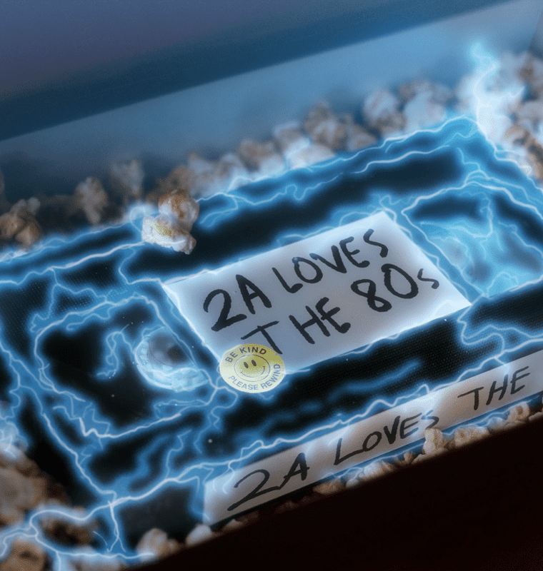
decorative image of a vhs tape in a box with a label that says 2A loves the 80s

08/18/2022

How my VCR breaks through the clutter

By Erin McCaul

decorative image of a vhs tape in a box with a label that says 2A loves the 80s

Image by Thad Allen

Once upon a Tuesday, my husband and I found ourselves with a wi-fi outage, an unexpected daycare closure, and calendars full of Teams calls. Wanting to maintain the façade of professionalism, we fired up our hotspots and dug my old VCR / VHS collection out of the basement for our kids.

As I explained the concept of rewinding to my wee Netflix horde, I thought about how the 80s are still hot. Top Gun: Maverick was a box office hit. Willow is getting sequel series. And thanks to Stranger Things, Kate Bush was back on the Billboard charts.

Here at 2A we love a good 80s throwback. For many of our clients, this theme hits home for their target audience and sometimes a DeLorean or a mohawk are just what it takes to break through the marketing clutter.

Here are four times we’ve reached back to the 80s to help our clients’ messages land:

So if you’re looking for a team that can spice up your datasheet with the brilliant purple from The Crystal of Truth in The Dark Crystal, or subtly reference Ludo from The Labyrinth in your next animation, drop us a line. We’re happy to let you borrow something from our VHS collection!

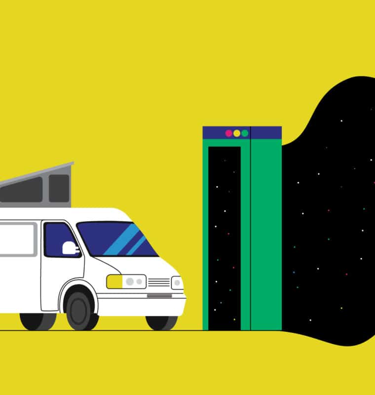
image of a van driving into a portal

04/18/2022

What building websites taught me about my 1997 Eurovan

By Erin McCaul

image of a van driving into a portal

Image by Guangyi Li

In September 2021 my husband and I welcomed our second child earthside. As we juggled newborn night feedings, calculated wake windows, kept our 4 year old entertained, and changed 10+ diapers a day we decided we needed more work and bought a 1997 Eurovan. Lovingly nicknamed Clark, we celebrated the end of my maternity leave with a two-week family road trip to see a friend in Salt Lake City, Utah.

In my role as a Program Manager at 2A, I’ve had the opportunity to build cool websites with our stellar in-house team of consultants, designers, storytellers, and developers. Lucky for me, I was able to apply 2A’s web process to get our van adventure ready.

Getting the wheels turning with a feature list

When building websites (and vans) the first question to ask is “what does it need to do?” Our van needed to make it 1,600 miles roundtrip to get us to Utah and home again, so we planned for safe car-seat installation, space for our down sleeping bags, a fridge install, and ample storage for snacks, ski gear, and toys.

Gathering requirements and objectives upfront ensures both smooth design and development phases. At 2A we meet with our client’s core team to really understand their vision and audience, and plan for the site’s functionality.

From bringing delicious apples to your doorstep, communicating the importance of healthcare interoperability, or building an interactive map for sports legislation every project starts with a feature list outlining what exactly the site needs to do and how we’ll do it.

Packing in the content(s)

My family loves camping, so before our trip I did an audit to see what I could move from our gear room to the van before placing a bulk order for mac and cheese. When building a website, it’s important to go through the same exercise with content and brand elements. Do you have an existing site that contains your brand gear? What content needs to be migrated, edited, or newly crafted? Are you keeping your current brand, opting for a brand refresh, or hoping for a new look and feel? What content do you have, and how does it need to be organized for users?

Taking it for a test drive

Before our trip we tested the van at our local ski hill and spent a weekend camping close to home. It was a great way to pressure test our designs for making coffee, sleeping, cooking dinner, doing dishes, and accessing toddler toys. Before launching a site, the crew at 2A tests all websites across different browsers and devices to make sure it all works and meets accessibility requirements before going live.  

Two days into our trip I was reminded that sometimes bugs pop up after launch—or in this case, mice. As I sanitized every surface of our van in a Walmart parking lot after discovering a mouse had eaten our bagels, I was grateful I’d planned to camp near cities with easy access to stores and Clorox wipes. To head off the unexpected at 2A, we plan for website soft launches. This means the site is technically live and discoverable, but we ask clients to hold off on announcements or marketing campaigns that actively send traffic to the site until we’ve had one last chance to check for bugs.

Towing the line on maintenance

An hour into our road trip Clark broke down in rural eastern Washington. One tow truck ride and a very kind mechanic later, we were back on the road after a few hours. The lesson? Vans and websites both require maintenance to keep them running smoothly. From WordPress version and plugin updates to new feature development, 2A has you covered well after your site goes live.

Ready for an adventure? Let’s build a site together!

The view is of a computer screen with a view of Microsoft teams

01/26/2021

Product demos—the greatest thing since sliced sourdough

By Erin McCaul

I’m the proud new owner of a quirky old house on a 2-acre homestead, and I don’t know how folks fixed things before YouTube. Video walk-throughs have taught me how to swap outdated light switches, build raised beds, re-plumb a laundry tub, and use a maul to split firewood. I’ve even taken up bread baking. Unexpectedly, the do-it-yourself trend recently cropped up in my 9–5 life outside the farm. At 2A we’ve been crafting click-through product demos that help sellers demonstrate the value of technical products to potential customers.

Ramp up quickly

Like a YouTube tutorial, snackable product demos are a great way for marketers to help sales teams ramp up quickly. Taking the prep-work out of product walk-throughs, these clickable demos can help teams sell new tools, brush up on product functionalities, or onboard new hires.

Visually engage customers

With an intuitive and engaging design, customers will feel like they’re in the actual product rather than a demo. This realistic experience makes it easy for potential customers to understand what makes your solution so valuable.

Tell value-first stories

Our clickable demos pair screenshots with comment boxes to prompt sellers on talking points throughout the demo. Sellers also have the ability to toggle the commentary off, giving more seasoned team members some breathing room as they walk through the product.

We’ve got a process that takes the guesswork out of demos. After an hour-long interview to learn about your product, our team does the rest. We craft a demo story to capture the featured use cases, mock up designs, write a script, package it all up for development, and deliver ready-to-deploy code packages in eight–12 weeks.

Ready to help your teams and customers re-plumb a laundry tub, master your product? We can help!

Tips for the 2020 holiday season

11/24/2020

Tips for the 2020 holiday season

By Erin McCaul

Tips for the 2020 holiday season

When November rolls around each year, my friends and family who celebrate Christmas divide into two groups: those who put their trees up before Thanksgiving, and those who wait until their turkeys have time to cool. I personally fall into the latter camp—and throw some serious side-eye at anyone who plays “All I Want for Christmas Is You” before Black Friday.   

But this year has been heavy, and 2020 isn’t closing out like any other year. My entire workday has turned digital, and like many families—we’ve decided to take our holiday gatherings digital too. However you celebrate, here are a few tips to help make the holidays special this year.  

Shop early and support small  

COVID-19 closures have hit small businesses hard. If you’re gifting, consider buying local, buying handmade, buying gift certificates for services, or buying from people you know. A key to supporting small is shopping early. Lots of independent bookstores, small shops, and artisans take online orders, but they need some extra time to package and ship everything off.  

And if you’re as sick of your own cooking as I am, consider restaurant gift certificates—or getting takeout over cooking your own holiday meal. Love libations? Many local breweries and wineries are offering curbside pickup as well. 

Get creative with your digital celebrations  

This year, everyone in my family is getting a Christmas package that includes Christmas crackers, over-the-top Christmas costume gear, and paintable wooden ornaments. If I can’t see them in person, I want to see them in reindeer antlers and blinking Christmas-light glasses over FaceTime. If your crew isn’t excited about blinking glasses, consider a holiday slideshow of old pictures to reminisce, or throwing together a trivia night to keep things light. 

Give to a charity  

2020 has brought unimaginable hardships to our communities. Food insecurity—already an issue—is on the rise. Millions of Americans are out of work. Schools are closed. Already vulnerable communities are suffering the most. Consider setting aside some of your holiday budget for charities or food banks, or even setting up recurring donations to give organizations near and dear to your heart steady funding throughout the year.   

I miss hugging my grandma. I miss seeing my friends. I miss schools. I miss my office and sitting in an actual conference room with my team. I miss crowded bars and waiting to be seated at restaurants. I’m tired. But I’m starting to see Christmas lights in yards and in town, like little lights at the end of 2020. And if your Christmas tree was up in October, I now say good for you.   

Bring a little orchard to your doorstep

10/08/2020

Bring a little orchard to your doorstep

By Erin McCaul

Bring a little orchard to your doorstep

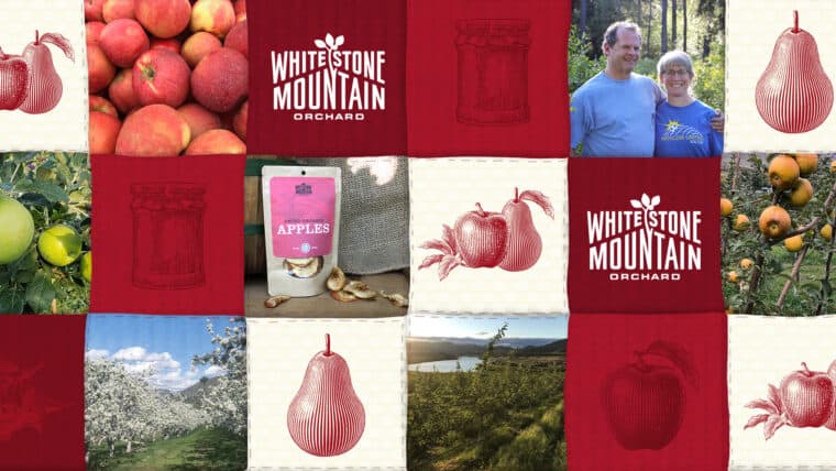
After reading The Omnivore’s Dilemma in 2010 I became a farmer’s market loyalist. I live for the first tomato of summer, love the sweet crunch of an over-wintered carrot, gush over peaches, and—much to my toddler’s dismay—refuse to buy bananas. So when Claire Lichtenfels and her husband Hal Jackson asked 2A to redesign the website for their small family-run farm, Whitestone Mountain Orchard, I knew it was my chance to put my pastoral passion to use. I instantly clicked with Claire and Hal, appreciating them on another level for their regenerative agriculture practices and support for local communities.

While it’s easy to miss the magic of food in a well-lit grocery aisle or PrimeNow delivery bag, this site was our opportunity to bring some farm goodness back to the shopping experience—and a few apples to your door.

Every heirloom has a story

Claire and Hal chose 2A because of our focus on storytelling. As owners of a third-generation orchard, it was important that their mission to promote the viability of local farms be front and center on the site, with plenty of information about the diversity of fruit they grow. We’re all used to Galas and Honeycrisps, but what about Stayman and Ashmead’s Kernel? Apples and pears are harvested August through January, and Claire and Hal are equally excited about every tree in their orchard. For each variety, we crafted mouthwatering descriptions, elevating the sweet snacks and seasonal stars. Their site has something for everyone, from apple subscriptions to gift boxes, and my personal favorite—the heirloom pie box.

Step into Oma’s kitchen

Claire and Hal radiate warmth, kindness, and good humor. When designing their site, we crafted custom linocut icons and paired them with photos of the farm. It all works together like a patchwork quilt—transporting you straight to the orchard. Perusing “The pantry” section of the site, I can imagine stepping into Claire’s kitchen, where like any fun Oma, she’s ready to show you how to make dried apples, or whip up some fruit butters to carry those fall flavors into winter oatmeal and toast.   

Treat yourself to some fall flavor

In a world of digital conveniences, eating seasonally brings a little magic to my menu. Plus, supporting small, local farms is my favorite way to give big agribusiness and monocropping the middle finger.

If you love apples, consider following Whitestone Mountain Orchard on Instagram and Facebook, or treating yourself to a box of seasonal goodness, delivered to your doorstep. I know I’ll be gifting some lucky friends and family holiday pears and heirloom pie boxes this year!

Case studies worth putting on repeat

06/25/2020

Case studies worth putting on repeat

By Erin McCaul

Case studies worth putting on repeat

Some songs are so good they deserve to be on repeat, like my current favorite, 25 or 6 to 4 by Chicago. The upbeat guitar riffs, sprinkle of trombone, and clever lyrics make the song worth hearing over and over any time I find myself facing a creative block.

Here at 2A, we recently redesigned our website—giving our storytellers, designers, and devs a unique chance to flex their creative muscles, explore new sources of inspiration, collaborate, and think big. The part I keep playing over and over? Our shiny new case studies.

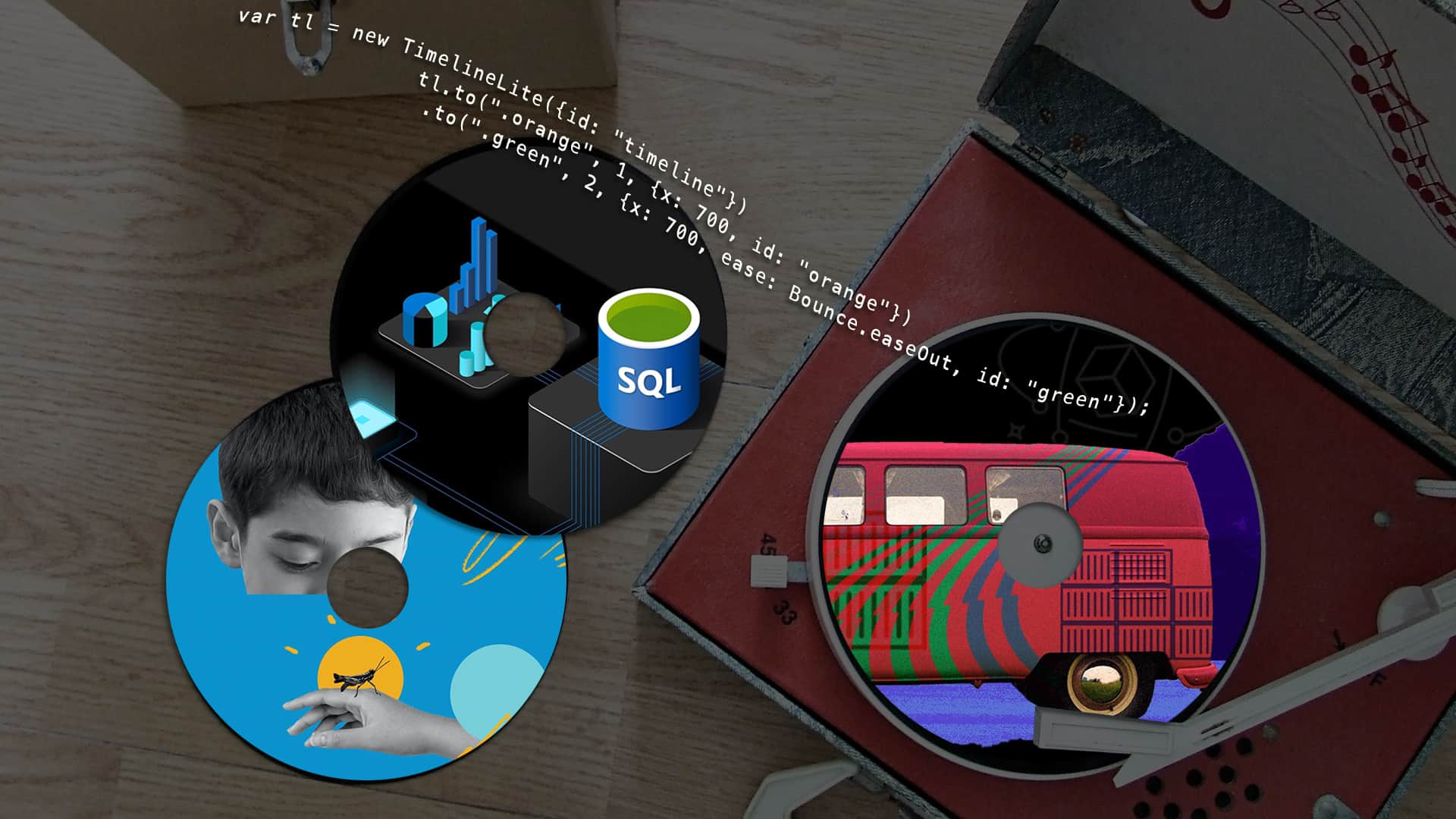
GreenSock animations make our stories dance

When we sat down to brainstorm ways to make these stories stand out, a key theme bubbled to the surface: interaction. Inspired by the layouts, transitions, and animations on Apple‘s website, we went to work exploring ways to bring our case studies off of the page. But first, we had to learn: How does Apple make their website look so cool? The answer? GreenSock.

While Apple’s product technology is historically secretive, their website uses open source technology called GreenSock to make a lot of the magic happen. Open source code is all about collaboration. It’s accessible for both tech giants like Apple, and small-but-mighty agencies like 2A. GreenSock makes creating animations and transitions a breeze with readable code, cross-browser and device compatibility, and modular code that allows developers to create an animation once and reuse it where needed. You can see this on our case study buttons. When you click a button to view a case study, there’s an animation that loads the page seamlessly. Once the page is loaded, a reverse animation makes the button disappear. GreenSock magic!  

Leaning in to fun concepts like a Grateful Dead spin on an AWS road show and a stadium-level roar for  The Sports Institute at UW Medicine, let us shake up the generic case study format and surprise viewers with unexpected content.

It’s not often we get to be our own client, and these opportunities to explore, experiment, and play recharge our creative batteries. If you’re looking for a little creative inspiration, take our case studies for a spin…again, and again, and again.  

Child riding a bike with a helmet

04/30/2020

This pandemic is a shit show

By Erin McCaul

Child riding a bike with a helmet

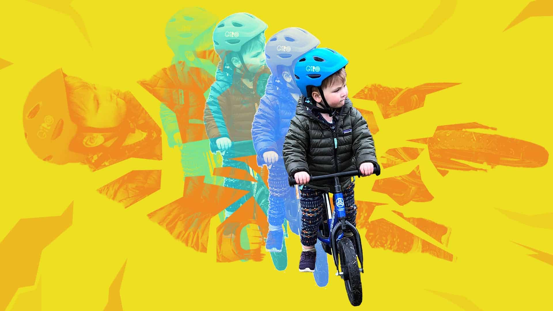
Like a lot of working parents, my husband and I are juggling our full-time jobs while caring for our 2-year-old, Connor. We fit work into the armpits of our day, keep Toy Story 4 on a loop, and collapse into bed every night feeling like we suck at parenting and our jobs.

One silver lining has been the extra time we have to teach Connor how to ride his bike. The empty parking lot across from our house has the perfect 2-degree slope to give him enough speed to hold his feet up and send it on his Strider. A few days ago, Connor asked to take his bike down a much steeper grassy hill. He’d been doing so well in the parking lot, I decided to let him go for it. Minutes later, I watched his face go from stoked to terrified as he crashed.

He took a handlebar in the chin and bit his tongue, with enough blood to be scary. He didn’t cry for long, and I sat there just holding him for a while after the fall—quietly giving him space to process what happened. I spent that shared silence thinking about how proud I was of this little person for trying something new, bold, and scary—staying curious as he tests his limits.

I thought about how each failure is an input that informs the way we try again. Later on, Connor asked to watch his favorite YouTube video from his hero, professional cyclist, Danny MacAskill. His new favorite part? The crash reel at the end. When Connor woke up the next morning, the first thing he asked was “Momma, we go ride my bike today?”

Adjusting to this new normal feels akin to crashing my bike on Connor’s grassy hill every. freaking. day. I still can’t figure out how to feel good at my job, be a good mom and partner, check in with my family and friends, clean my kitchen, drink enough water, or sleep enough on any given day.

Instead of expecting that I’ll do this new thing perfectly, I’m ready to accept that I’m going to crash, get up the next day—and try again.

When the stories to tell are paintings by Colombian ex-combatants

11/01/2019

When the stories to tell are paintings by Colombian ex-combatants

By Erin McCaul

When the stories to tell are paintings by Colombian ex-combatants

In college, I got a C in art history. I thought I appreciated art, but after that grade I told myself I was incapable of understanding it. That changed when I was introduced to the work of Juan Manuel Echavarría.

Echavarría and his team have created a significant body of work focused on Colombia’s long-running, armed conflict. His art explores how decades of war has impacted rural communities and normalized violence.

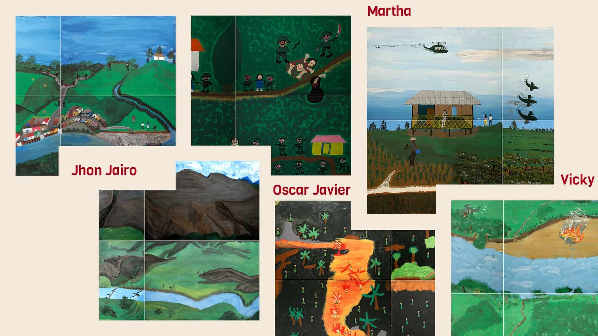
Recently, 2A created an online gallery for La Guerra Que No Hemos Visto (The War We Have Not Seen). From 2007-2009, Echavarría, Fernando Grisalez, and Noel Palacios—as part of the Fundación Puntos de Encuentro—organized painting workshops for former combatants. Armed with wooden panels, vinyl paints, brushes, pencils and erasers—these ex-combatants painted their truths. The goal was not to teach them how to paint, but to give them a medium to share their war stories. The project includes 480 paintings from former members of the United Self-Defense Forces of Colombia (AUC), the Revolutionary Armed Forces of Colombia – People’s Army (FARC-EP), and the Colombian Army.

Our aim for the website was to ensure the technology behind it melted into the background, and the design differentiated it from a colder, Chelsea-level gallery site by surfacing the humanity. And the artist-driven, cross-continental, complex nature of the endeavor presented some meaty challenges.

We worked with Echavarría and his team to select close to 100 paintings for the site, then wrangled names, bios, and painting synopses in both Spanish and English. We workshopped UX challenges—how do you handle navigation for a multi-lingual site? how can we best connect related works? how do we let viewers zoom in close enough to see the finest painting details on mobile? We wrestled with the site structure, landing on an experience that let artists, curators, academics, students, writers, and regular old C-in-art-history folks like me find a way in to the work.

The result is a site that invites us to look darkness, terror, and unimaginable loss in the eye. The stories had me in tears more than once, feeling absolutely gutted. But the work documents memories that shouldn’t be forgotten, giving voice to those who have been silenced. As a team of storytellers, we’re honored to help Echavarría share it with the world.

Let’s make the sick day a noun again

07/03/2019

Let’s make the sick day a noun again

By Erin McCaul

Let’s make the sick day a noun again

For someone who generally dislikes sitting still, recovery has always been an active verb. I run, climb, hike, ski, and bike, and recovering has meant yoga and foam rolling, pulling garden weeds, or walking my dog. The idea that recovery could also be a noun that describes just resting didn’t dawn on me until I read Good to Go: What the Athlete in All of Us Can Learn from the Strange Science of Recovery by Christie Aschwanden. She roped me in with her study on whether or not beer aids recovery after running, and blew my mind with her revelation that recovery used to be a noun, but has evolved into a verb—and not always for the better.

My son is almost 2 years old and goes to daycare full time. As a household it feels like we’re sick every single week. While my son bounces back from everything within 24–48 hours, his toddler super germs lay siege on my white blood cells for weeks at a time. I used to think that I could will myself healthy with Emergen-C, Throat Coat tea, and strong coffee. Just another active-verb type of recovery to fit into my busy life.

The partners at 2A recently reminded us all that WFH (work from home) days shouldn’t replace sick days. Thinking back on it, I realized it had been six years since I’d taken a real sick day—a genuine, stay-in-my-jammies, watch-bad-TV, nap, camp-on-the-couch sick day. Instead, I would push through it, trading rest for dialing into meetings, working on projects, and responding to messages. I convinced myself these days were restful because I wasn’t in the office. But nowadays, I’m not so sure about that.

Besieged by the latest round of toddler germs, I decided to try something radical. With the support of my manager and team I took an actual sick day. I spent the day napping, eating soup, and sipping tea. I generally stayed offline and truly rested. And you know what? It worked. I got better, faster. I felt sharper at work and was a more present mom and partner at home.

One of our words we work by is “great work requires being well,” and that sentiment has empowered me and the rest of my team to take real sick days. While my recovery as an athlete remains an active verb, I’m happy to report my sick days are officially nouns again, and that is helping me stay active.