Blog

Rachel Adams

Rachel would prefer to spotlight her dog, Baker, but then we wouldn’t know about her amazing design skills. Unlike Baker, Rachel’s talents go far beyond sit and stay. Her portfolio includes packaging, branding, and fine art. How bow-wow that!

Managing Designer | LinkedIn
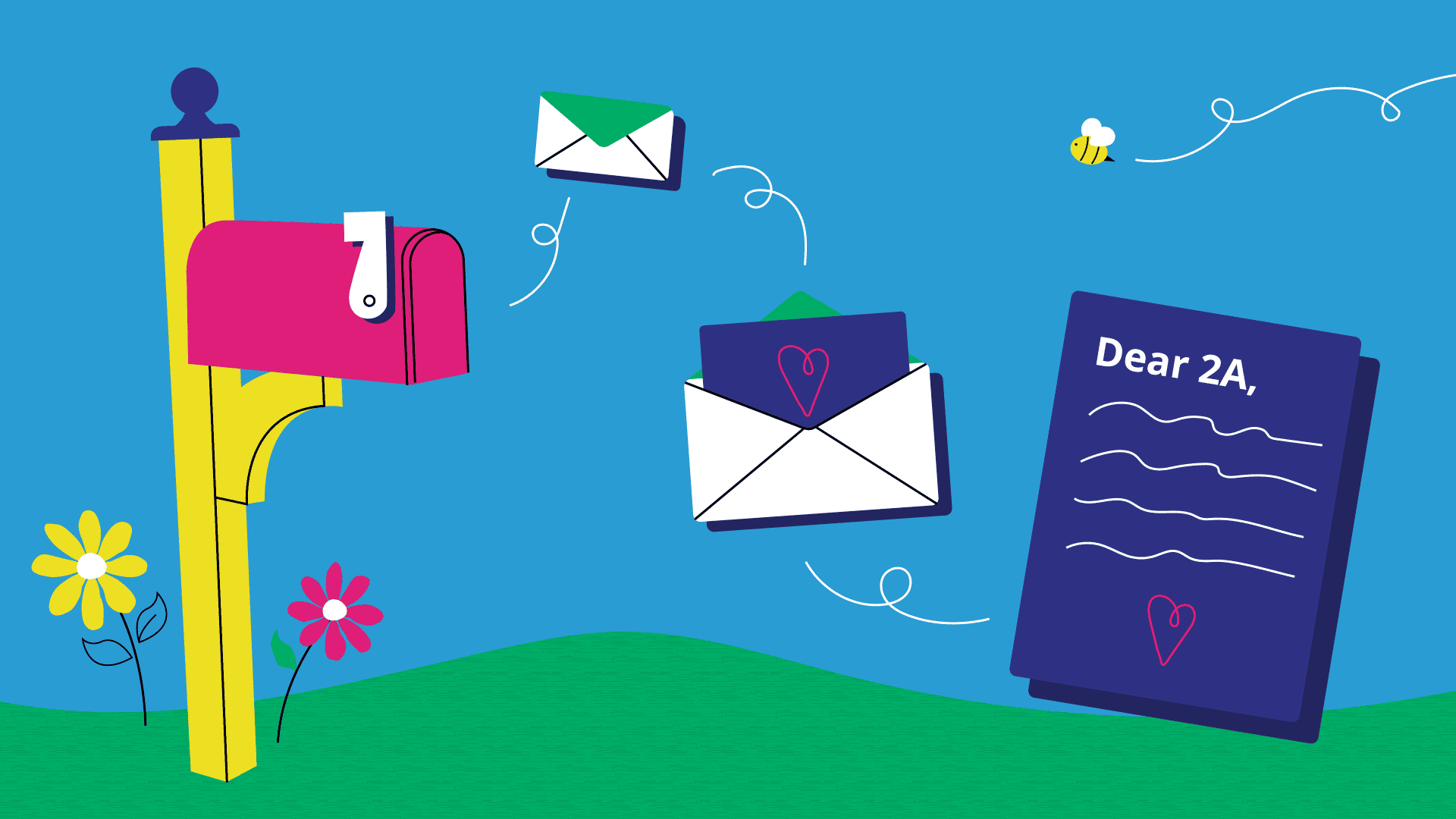
Image features a pink left on the left side of the image with three envelops drifting towards the right side of the image.

03/25/2024

Thanks for the parental leave, 2A 

By Rachel Adams

Image features a pink left on the left side of the image with three envelops drifting towards the right side of the image.

Image by Rachel Adams

Dear 2A, 

Thank you for making my maternity leave a wonderful experience! I felt supported through the whole process—from planning my leave to spending time away and returning to work. 

I appreciate the flexibility the 2A parental leave policy offers as everyone’s needs are different. I was thrilled to have the baseline 12 weeks of paid time off and to be able to take 8 weeks of unpaid time on top of that. This allowed me to recover after labor and figure out how to take care of my newborn son. As a first-time mom, there was a lot of learning! Additionally, leading up to my leave I felt a lot of love from the team, celebrating with a virtual baby shower and gifts for the baby. From the beginning, you made me feel like I was being set up for success. 

My time away from work is something I will cherish for the rest of time. Thank you for giving me the space (real space!) to bond with my baby without interruption. While there were a lot of necessary duties like doctors’ appointments, there were also a lot of meaningful moments like meeting grandparents, aunts, uncles, and cousins. It seems uncommon for a company to respect these boundaries given how connected we are to our work in this digital age. 

Returning to work after taking time off can be very stressful, but you’ve let me ease back into my role. You recognize the humanness of transitioning back into work mode and adjusting to a new schedule and routine. Not to mention dusting off the cobwebs that had weaved their way into my brain! The team welcomed me back enthusiastically and that made me excited to be back with my coworkers. I was also delighted to connect with everyone in person at the summer retreat shortly after I returned to work. Making those in-person connections was the cherry on top of returning from my leave. 

Being a new parent is scary and stressful, but being a new parent at 2A takes unnecessary stress out of the picture. Thanks again! 

With love, 

Rachel 

Ideas born in quarantine to help with your 2020 pivot

02/10/2021

Ideas born in quarantine to help with your 2020 pivot

By Rachel Adams

Ideas born in quarantine to help with your 2020 pivot

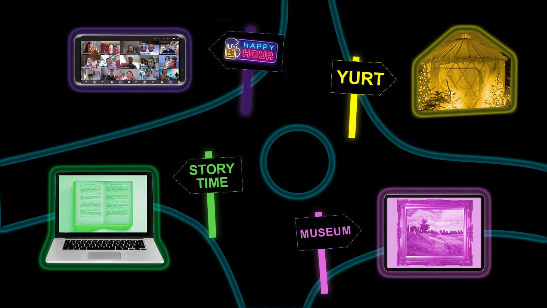
2020 hit us hard. It brought upon more challenges than any of us could have ever imagined. But I’ve been so impressed with the creative ways companies have pivoted in order to keep their businesses running. I saw restaurants offer dining experiences in a yurt, museums offer virtual tours, libraries offer virtual story time, and more! There was so much innovation born from the world shutting down because of the Coronavirus.

At 2A we pivoted in our own way. With everyone going remote, we were challenged by the increasing demand for digital content and focus on virtual experiences. We pushed ourselves beyond what we already knew to expand our offerings.

Here are a few ways we pivoted in 2020:

  • Full-stack case study – We put engaging copy and arresting design into motion, creating a scrollable, interactive web experience. These full-stack case studies take the digital web experience to the next level to tell classic customer stories.
  • Click-through demos – These click-through product demos help sellers demonstrate the value of technical products to potential customers.
  • Video from afar – Don’t have a videographer on call? No problem! We’ll send you a kit with all of the tools you need to create video content from the comfort of your home office.
  • Virtual keynotes and talk tracks – Our virtual keynotes wow remote audiences with exciting morph transitions and talk tracks that hold their attention. Even though we pivoted to design keynotes for smaller screens, they still had a big impact. Dance moves included.
  • Animations – Animations are blazing hot sauce in marketing today. They’re informative, persuasive, and add a spicy zing that keeps your company top of mind. Last year our animation practice grew 250 percent.
  • 2A culture – Even though an impromptu Teams call doesn’t quite replicate the water-cooler chat, we have connected with each other in different ways from our home offices. We’ve enjoyed virtual ice cream parties, happy hours, and even baby showers!

I’m not sure when life will go back to the way it was before COVID-19 but until then, we can help with your pivot. Let’s ride this wave of virtual experiences until we can collaborate in person again.

Designing the abstract

10/01/2020

Designing the abstract

By Rachel Adams

Designing the abstract

When I graduated college in 2011, artificial intelligence and machine learning were not topics that surfaced regularly in our graphic design classes. Now, almost 10 years later, as a designer at a B2B storytelling agency, I’m creating technology marketing materials for these abstract concepts on a daily basis. It can be intimidating designing for big tech ideas, but here are a few tips I’ve learned to help navigate the process.

Go with what you know

Certain design metaphors already exist in tech marketing, like a lock representing data security. There is sort of this unwritten rulebook of icons for designers. Sometimes these icons make sense and sometimes they feel like a stretch, either way it is a good North Star. For example, I understand why a cloud represents the cloud but ever wonder why a can represents a database? Assigning a design element to an abstract idea makes it feel more tangible and helps tell a story in a visual way.

Be original

While there are some general tech marketing design guidelines that exist, each project is different. As an agency, we want to give clients unique designs so not every keynote presentation looks the same. Always look to a company’s brand guidelines and try to get creative about how brand details are incorporated. Elements like color, pattern, and iconography are cues we can massage into the design to ultimately delight the client with a final product that stands out.

Don’t forget fundamentals

Even though these tech themes can be abstract, it’s important to keep in mind the fundamentals of design. A website layout still needs to have some sort of hierarchy, words on the page of an eBook need to feel balanced with the visuals, and an infographic should guide the viewer through a story. Using these visual elements in the right way make these big ideas easier to digest.

Eventually we will have to visualize abstract concepts that haven’t been thought of yet. What comes next beyond artificial intelligence and machine learning? It will be interesting to see how the design of tech marketing evolves. I hope it’s something fun and colorful…like rainbows or trolls.