Blog
Chocolate For Choice postcard front

04/06/2016

Celebrating choice, with chocolate

By Theresa Howe

Chocolate For Choice postcard front

Chocolate? Choice? Sounds great to us. That’s part of why we were thrilled to help our friends at NARAL Pro-Choice Washington amp up their annual event, Chocolate for Choice. Picture an evening of chocolatey creations from confectioners all across the city, delicious craft cocktails, and a room packed with people who care about ensuring that Washington continues to lead the way in the pro-choice movement—and love chocolate.

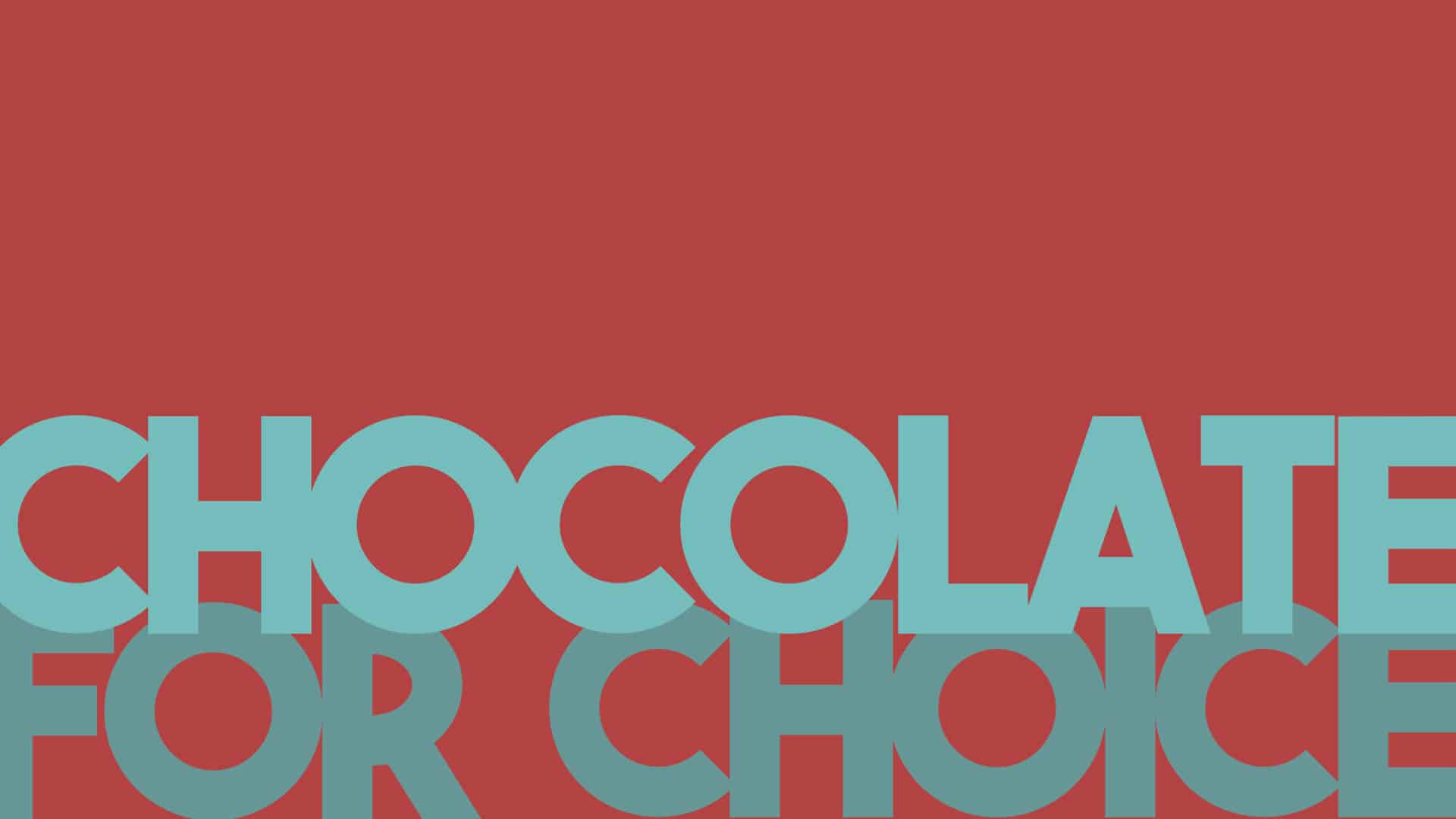
We pitched in by designing a postcard to get Chocolate for Choice newbies excited about coming out, and came up with this luscious, every-letter-is-a-bon-bon visual to anchor the evening.

The event was their most successful Chocolate for Choice to date, attracting over 100 new attendees and besting the fundraising goal. Even the Mayor of Seattle came out to enjoy and judge the chocolate delights. We hope to see you there next year to sample some chocolates and support the good work of our friends at NARAL.

Is your favorite event this delicious?

.what

03/23/2016

.what?

By Abby Breckenridge

.what

Web addresses are changing. Have you noticed? We’re no longer limited to the old standards of .com, .gov, .net, and .org. Instead, a cruise through the internet will reveal a bonanza of new options: .yoga, .online, .marketing, .sexy, .buy, .read, .family, to name a few.

Generic top-level domains (gTLD), or the letters that come after the dot, are now for sale. ICANN, the international non-profit organization that coordinates unique web addresses, sells gTLDs to lucky applicants for $185,000 a pop. Why pay such a high price? There are a few reasons.

  • Betting on a market need. The growth of the internet has left very few attractive addresses available, and with over 820,000 new websites a day, choices getting bleaker. Google’s new company Alphabet can be found at abc.xyz.
  • Preventing fraud. Many businesses are buying their trademark gTLD to help fend off copycat sites which lure customers with almost-the-same addresses and scam for personal info. Barclays can be found at home.barclays, and hundreds of other companies have purchased their namesake gTLD.

As part of our recent rebranding from 2Adaptive to 2A we needed a new url. 2A.com wasn’t available, so we dove down the rabbit hole of new gTLDs and found something not only suitable, but better. 2A.consulting is clean, modern, and specific about what we do. Turns out, we’re in good company.

Hello my name is 2A

02/16/2016

We’d like to (re)introduce ourselves. Hi, we’re 2A.

By Abby Breckenridge

Hello my name is 2A

“Less is more work.”

It’s architect Rick Joy’s bastardization of Mies van der Rohe’s oft-cited modernist aphorism “Less is more.” It’s also a phrase we take to heart here in the office as we help our clients tell their stories. There’s an elegance in simplicity and it doesn’t always come easily.

Our work is to help our clients say more with less—to be crisp and impactful as they connect with their audiences. Sometimes it’s easier to be verbose, but we’ve found it works better to be intentional and cut the fat. Making every pixel count is at the foundation of what we do, and it comes from a practiced collaboration between our consultants, writers and designers.

So we decided to make the cobbler’s kid some shoes and tell our own story with less, starting with our name. Meet 2A.

2A is a slimmed down, cleaned up version of who we’ve always been: 2Adaptive. Our roots in adaptive management still inform who we are, but our commitment to elegant and impactful storytelling is more who we are today. We’re excited about our new name, and we’re even more excited to work with you. Take a look at some of our favorite projects and send us a note.

Eisenhower Decision Matrix diagram

02/10/2016

Urgent and important

By Abby Breckenridge

Eisenhower Decision Matrix diagram

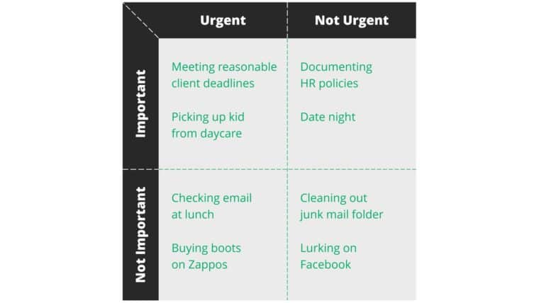
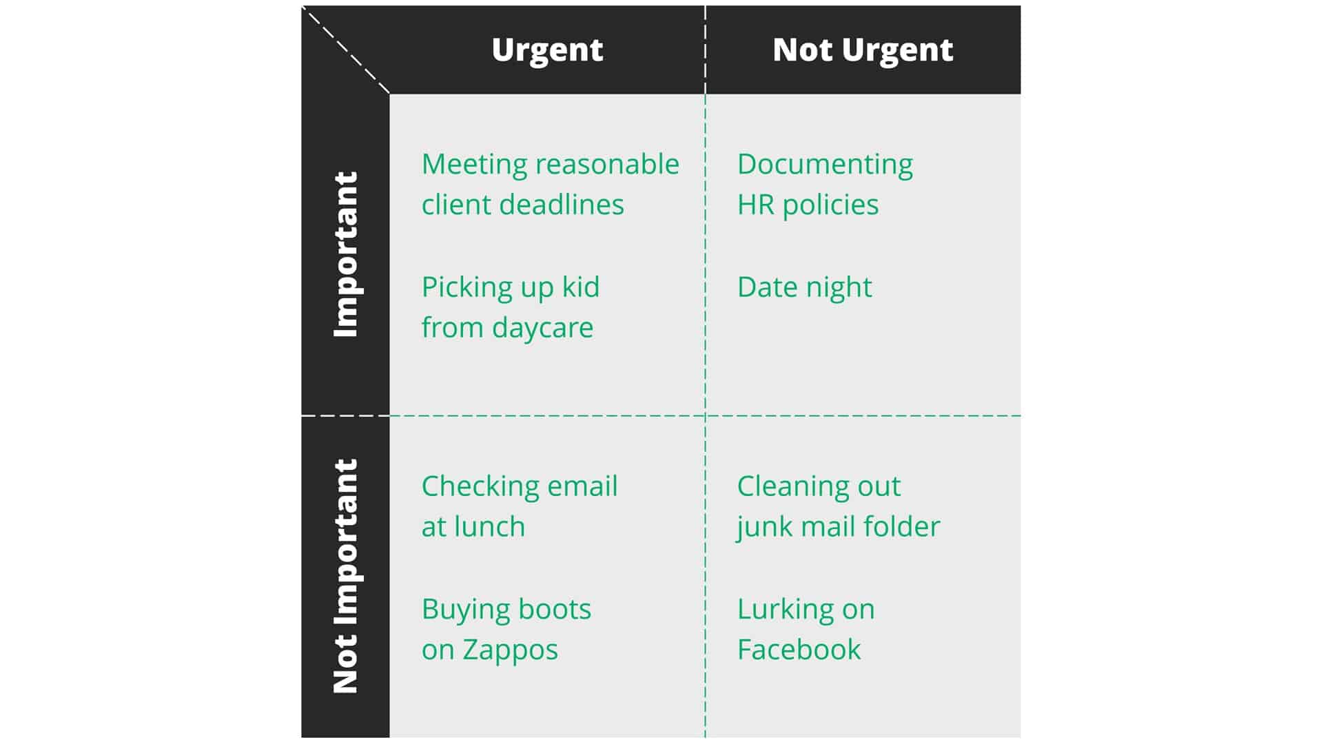
We’re just finishing up a classic four-square framework for a client—the ubiquitous diagram favored by MBAs where you place things along a two continuums, left-to-right and top-to-bottom, always aiming to direct the eye of your viewer to that enviable position of the upper right-hand quadrant. It’s popular because it’s good, and provides a clear method to quickly visualize a landscape of options based on a few key criteria. But like a good pop song, when you’ve heard it one too many times, the shine is off and it gets annoying (Hotline Bling, anyone?).

The exercise reminded me of my favorite four-square, one I always go back to when things get busy. The Eisenhower Decision Matrix reminds us to make sure we’re spending our precious time wisely, and getting the right things done. The truth is we all spend time in each quadrant and that’s not going to change, but like all things tempting, the skill is in the balance of not overindulging in any one quadrant.  In general, we spend too much time in urgent/not-important (checking email on our phone as we walk to the bathroom) and not enough time in important/not-urgent (date night).

How do you parse your day?

Story seeking

01/28/2016

Story seeking

By Soleil Kelley

Story seeking

What’s it like being in love and coping with the death of your spouse of 70 personalities, or, being an Afghan boy when a gun-wielding Talib enlists your help to win over the heart of a girl in your village? I recently took a storytelling class through CreativeLive, taught by Snap Judgment podcasters Julia DeWitt and Anna Sussman, who didn’t answer those questions, but instead shared how they went about crafting stories around them. Finding these stories seems daunting, but they exist in every corner of society across the globe. You just need curiosity, persistence and your human nature.

“How do you go about finding these stories, these people?” asked a class attendee. Their responses outlined what many creative professionals do every day—consume content they find personally interesting, with openness and curiosity.

Anna and Julia walk through the world and consume content with their antennae up—every waking moment. They’re curious people, and when coupled with their personal interests, they can readily find little gems, little seeds of something that could be their next story. Then they dig.

As a longtime musician and music producer, I can relate. If I listen to my favorite artists or songs intently, I might uncover a little melody or styling that could become the basis of an entire tune, just as a graphic designer might scroll through a magazine and pick up an element that influences a logo they’re working on. David Bowie, RIP, touched on this cycle of influence humbly. “Frankly, I mean, sometimes the interpretations I’ve seen on some of the songs that I’ve written are a lot more interesting than the input that I put in.” Interpretation is our human nature. We observe, discover, interpret, and then share. Anna or Julia might pick up a little seed of a story, then tell it in a unique way, or from a different angle.

Having listened to songs with open ears for so long, I’ll never know what it’s like to listen with untrained ears. I can certainly turn off my radar, but then the music becomes, well, background music. If I focus, if I listen, the antennae go up.  Am I alone in this? Doubtful, but how is it different for musicians vs. storytellers vs. designers vs. photographers? Perhaps that’s just the very seed of a story worth exploring.

01/06/2016

Say it like you mean it

By Theresa Howe

Storytelling. It’s what we do, all the time, whether we are conscious of it or not. It’s how human beings relate and how they experience reality. All of the talk we give ourselves about facts and reason is nice, and we try to function rationally, but at the end of the day, human stories are what convince us to act. Tales of people overcoming struggles, individuals that do amazing things, those are what move us.

There’s some interesting psychology in the mix. Proximity is key. Relatability is another. How comfortable or uncomfortable the story makes us plays a role, in sometimes surprising ways. For example – if you are trying to get people to engage with an issue, pick one example of a person who has done something extraordinary. If you try to highlight a group, your audience will find it harder to relate. With too many people, the problem seems too big. Give one success and we feel like we can change lives.

I had the opportunity to attend the Non-Profit Storytelling Conference in November and it was a great couple of days, fully dedicated to storytelling. In context, it was a lot about how to improve your organization’s ability to fundraise, but in reality, you could replace the word “donor” with “audience member” and most of the content was fully relatable to any story you want to tell. It remains true whether it’s a story to prospects to convince them to buy your product, or a tale you want to tell your best friend.

As Maya Angelou said “People will forget what you said, people will forget what you did, but people will never forget how you made them feel.”

What’s the best story you’ve crafted?

The worst slide

12/09/2015

9 ways to make your presentation not suck

By Soleil Kelley

The worst slide

If querying the internet for “presentation tips” you’ll most often find reference to the 10/20/30 rule, introduced by Guy Kawasaki or the famed KISS principle (keep it simple stupid). Both are excellent rules to keep in mind, but sometimes you want to dive deep into your slide content, not just how you deliver it. For just that reason, I’ve created the following list, so you might avoid “worst slide” honors.

9 WAYS TO MAKE YOUR PRESENTATION NOT SUCK
— answer these questions before you consider your presentation “ready” —

  1. STORY In one or two sentences, what is the storyline of your presentation?
    Perhaps a challenge is solved, a business anecdote is told, or an idea is shared. Whichever it may be, neuroscientists agree that humans are more likely to be engaged by a story, than facts and figures. Ironically I’m convincing you with a fact, but that’s also the point. Tell a story, support with facts.  What makes a good story, we’ll save for another time.
  2. DESIGNIs your story supported by the graphics or images on screen?

    Our brains process visual content super, super-fast. We’re then anchored by it. The fonts and color you use, the layout and the graphic elements­—they matter more than you think. Make sure your slides are designed well. Like #1 above, what makes design great deserves its own post.
  3. AUDIENCEAre your slide contents consistently directed to the right (target) audience, and are they business or technically oriented?
    Know your audience and how the presentation will be used. Whether you’re presenting to 1, few or many people, consistently address them through the same point of view. If you have multiple targets, be sure each slide addresses each target without becoming awkward. Otherwise, make two presentations.
  4. TONE – Does the tone of voice change within or across slides?
    Be sure the words on screen don’t jump from casual to formal, or sassy to serious, otherwise presenting them is difficult. Be consistent within each slide and across the entire deck.
  1. ALTITUDEDo the slides include the appropriate level of details for the audience?
    Naturally, a CTO is concerned with different things than an app developer. Know the audience and include only relevant details they connect with.
  2. STRUCTUREDoes the audience know where they are in the storyline?
    Your story has a structure, so keep the audience oriented. Looking at the headlines and subheadings apart from the rest of the slide content is a good method for ensuring the structure flows well. Each slide should be necessary and fit in your desired structure. Use orienting slides, like an agenda, section headers, or breadcrumbs if the presentation is long.
  3. QUANTITY – Are you trying to land too many ideas on each slide?
    Remove the unnecessary by condensing your content to only the most salient points that support the slide takeaway. If you feel some audience members will desire more detail, create additional slides for the appendix.
  4. PARALLELISMIs your slide content parallel in structure?
    Mixing facts with directives with benefits with questions is hard to follow. Use the same pattern of words or clauses to show how each piece of content is related. Note how I’m organizing this list with a category, followed by a question, followed by notes or advice – that’s being parallel.
  5. ACTION – Does the audience know what they need to do next?
    Great presentations move people toward action, even if that action is feeling something. So, ensure that you weave in your desired outcome into the structure of the story.

2A tells business and brand stories all day, every day. Reach out to us anytime—we’d love to tell yours, too (see, that was my #9)!

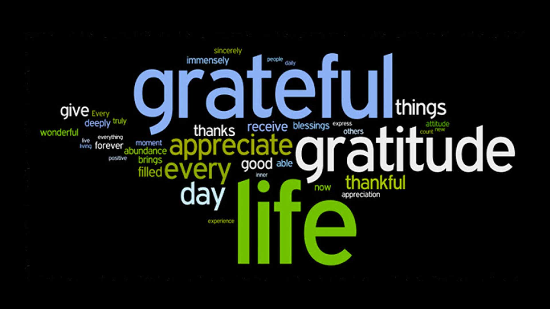
Gratitude word cloud

11/25/2015

Gratitude

By Theresa Howe

Gratitude word cloud

There’s about to be a turkey explosion, at least if predictions around the 2A office are correct. Some people are flattening birds to speed cooking time (spatchcocking, for you experts), some are having huge gatherings and hence huge birds, others are barbequing and smoking multiple turkeys. I’m cooking a 14lb bird for 2, because it’s the smallest one I could get my hands on readily. It’s going to be awesome.

This is a time of the year when we focus on remembering to be grateful for the things, and by things I really mean people, that enrich our lives. Whether it’s colleagues and clients or family and friends, we’re feeling pretty grateful to get to do what we do every day.

So while we contemplate the good things in life, I’ll leave you with this partial gem from the Oatmeal. If you aren’t familiar, he’s a Seattle guy with an insanely popular website who writes comics online, books as well, sells merchandise and sponsors running events. He’s a colorful guy and so is his take on Thanksgiving.

church and state

11/11/2015

Trumped-up content

By Kelly Schermer

church and state

As proof of the moral crossroads at which we stand as marketers, Donald Trump is running for president.  Is he a man or a brand?  Does his agenda include the American public or his personal empire?  His rise in the polls proves to me how powerful even bad marketing can be.  Which begs the question how far is too far to push your brand?

Native advertising, an emerging form of advertising, places marketing content where journalistic content has previously resided – think an article on CNN.com about the Top 10 Ways to Save Energy sponsored by GE.  Much like Donald Trump at a presidential debate, I believe native advertising poses a quandary for marketers and brand managers in that it can very easily feel slimy and wrong.

A while back, John Oliver did an exposé on native advertising from the journalist’s perspective.  In a nutshell, he postulated that consumers have proven unwilling to pay for news in its current form, so media organizations have had to find revenue streams elsewhere.

Most publications today have rules about native advertising that are supposed to help readers discern which articles are true journalism and which are trumped up ads, but I think it’s still hard to differentiate them at times.  I understand how some people might feel they’ve been purposefully deceived if they’re not aware they’re reading a new-fangled advertisement.

So where do I fit in as a marketer?  Am I contributing to the erosion of the free press and building mistrust in my audience or am I helping my brands talk to their customers?

I think the answer is that we haven’t got the answer yet.  I believe that if we want the media organizations to be responsible to the public and not the brands, the public will ultimately have to pay for journalism. But how do we create enough value to inspire people to pay for something they currently think should be free?

Now THAT sounds like the right place for good marketing.

bullets

10/29/2015

Hey, your bullets are showing

By Soleil Kelley

bullets

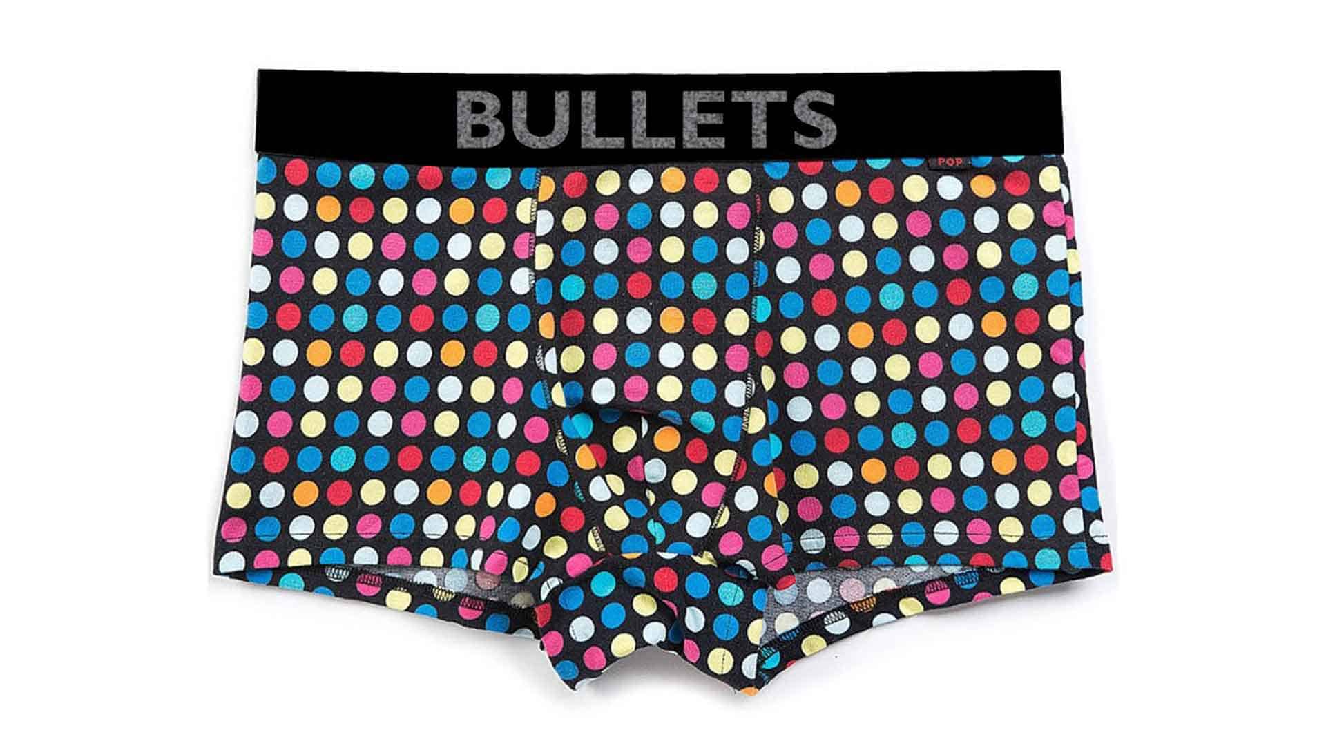
Admit it, you’ve probably had a version of the following ‘Ah, I’m naked! dream’ when you were young; you show up late to class and realize as you walk in front of your teacher and peers that you’re in your underwear, or worse, nothing at all. Frozen. While you probably don’t have that dream anymore, maybe you’ve had a similar experience as a professional. That is, standing before your colleagues presenting a slide you didn’t adequately prepare for, reading the bullets right off the screen. Close your eyes for a second…  Have you been there? Did you feel like people could read through you, right down to your underwear? Polka dots, of course.

Which brings me to my point about bullets. In all their facility, in all their brevity, bullets are pretty much the underwear of your presentation. Except they’ll never be sexy. Think about it. Underwear. Your trusty standby. The first thing you put on in the morning. They are (ahem) brief, and serve many a purpose, from comfort to support. They’re with you all day long, underneath it all, as you present yourself to the world. There are even those folks who skip the underwear and go straight to slinky shirts or skinny jeans, who must be either very self-confident, or don’t mind exposing themselves a little. I could go on, but I think you get the point.

Now, before you don a bullet on a slide, ask yourself: do I want the audience to see my underwear?  Unless you’re the Naked Cowboy, or model for Fruit of the Loom for a living, that answer is probably no. Instead, use bullets when outlining your slides to ensure you have your details straight, then dress your slides with meaningful images or visuals that capture an important concept or tell a compelling story. Ultimately, what’s great is that you’ll know your bullets are there if you do have to strip down to the supporting facts.