By Abby Breckenridge

Let’s get virtual—hosting captivating events from afar

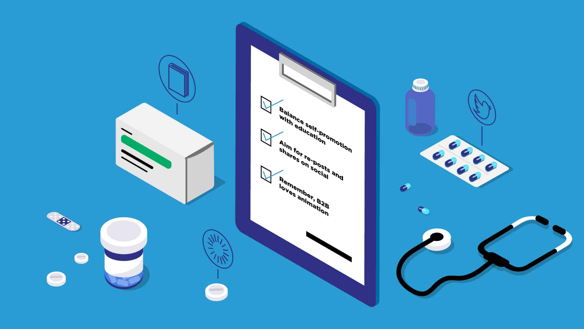
Switching your in-person event to a virtual one is this season’s must-have marketing move. Everyone’s doing it. So how do you make your webinar a showstopper? Here are our top tips to ensure success.

  1. Invest in getting people there. Send multiple, targeted email invitations and drive them to an engaging registration page with clear takeaways, ideal attendee personas, well-crafted session descriptions, and presenter photos.
  2. Practice makes better. A virtual event can still run into the same logistical kinks as an in-person experience. Be sure to gather all your presenters together for a dry run beforehand, and practice hand-offs between speakers.
  3. Agree on a presenter dress code. Just because it’s virtual, doesn’t mean we can’t see you! When you have multiple presenters, it’s nice to standardize the mood so someone doesn’t show up in a robe broadcasting from their closet, then hand it off to a colleague in a tie.
  4. Anticipate more attendees. It’s far cheaper to send 30 people to an online event than on a plane across the country, so make sure you track registration counts, confirm your online meeting platform can handle high traffic, and give your IT department a heads up—nothing says failure like a mid-session app crash.
  5. Keep sessions short. People get distracted more quickly when they have the whole internet at their fingertips, so limit sessions to 30 minutes.
  6. Plan for too short. Talks tend to tick along more quickly when the speakers don’t have the energy of an in-person audience. Presenters won’t know if their joke leads to chuckles, so there won’t be pauses for laughter. In case of wrapping early, keep your attendees engaged with a fun break experience and a note about when the next session will start.
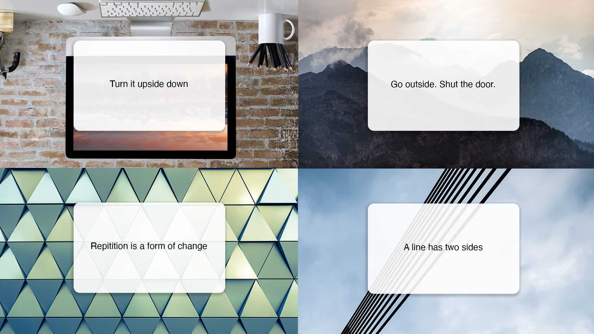
  7. Tell breathtaking stories. Talk tracks and slides will carry a heavier load than usual, so don’t skimp. Here are our tips for what’s hot in slides.
  8. Share the screen. It’s most engaging to share a visual mix of the speaker, demos, and their slides—that’ll require a producer on the backend to do it well.
  9. Be ready for questions. Attendees will still want to ask questions and make themselves known to the presenter. Use a moderator to gather and share questions or schedule a Q&A where attendees can queue up to ask in their own voice.
  10. Give your content legs. Plan to share resources like event recordings, decks, whitepapers and other related content to capitalize on the momentum.
  11. Don’t drop the marketing ball. Capture and segment all engagement, then plan your next touchpoint, whether it’s a follow-up email, a private demo, exclusive access to an eBook, or something else.

We’d love to help make your just-turned-virtual event a worthy marketing investment. From start to finish—promotion, registration pages, speaker training, talk tracks, slides, follow-up, and project management—we’ve got your back. Drop us a line.

By Guy Schoonmaker

Dartmouth campaign graphics

When you think of fundraising for colleges and universities, your first thoughts are probably something like “ugh, junk mail and relentless phone calls from students asking for money!”

You’re not wrong, but as a former higher-ed fundraiser, allow me to offer a counter perspective.

What really bugs you, other than paying off student loans (been there), is that you’re getting the same content and message every year, and it’s not personalized to your experience.

Universities aren’t staffed and resourced like Fortune 500 companies. It’s usually one person who is responsible for planning, segmenting, and executing the marketing campaigns. With so much to do, it’s easy to de-prioritize content and lean on the letters, emails, and call scripts from last year.

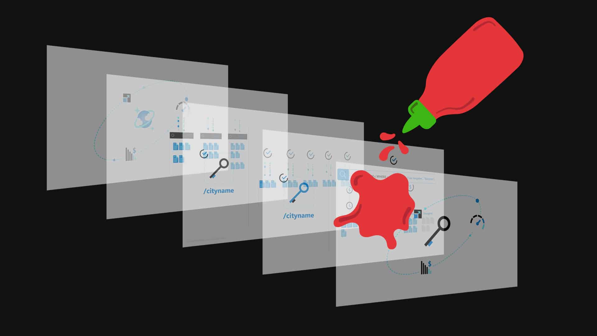
The Dartmouth College Fund was in a similar situation last fall, planning for a campaign that celebrated the school’s 250th anniversary. But they lacked the bandwidth to create unique, new content worthy of the milestone. That’s where we came in—delivering a feature animation, four GIFs, two emails and an infographic. Altogether, this fresh approach inspired over 4,700 donors to make a gift, nearly doubling the campaign’s 2,500-donor goal.

Content matters. Some super famous tech CEOs might even say “content is king.” We’re here to help when other things get in the way, so you can keep your audience… content.

By Mitchell Thompson

PowerPoint crystal ball

At 2A, a lot of our design efforts go into shaping presentations to tell a great story. We’re constantly pushing the limits of what’s doable in PowerPoint, striving to make presentations interesting and engaging rather than a bland slog through bullet points. Making them sing requires staying on the pulse of the latest trends. With a new year upon us, here are some hot design tips to make sure your presentations aren’t trapped in the past.

Sanding off the edges: removing the details from illustrations and icons

Screens are becoming capable of higher definition all the time—from Apple’s Retina to Microsoft’s ClearType to 4K TVs. But rather than cramming details into every pixel available, the savvy designer takes a simpler approach to the crisp clarity provided by high-res screens. Here’s what’s hot:

  • Illustrations are headed toward one of two minimalistic paths: solid block colors or open outlines.
  • Icons are becoming more abstracted rather than finely detailed.
  • Similar graphic styles are used to communicate information; for instance, infographics are replacing charts, visualizations are superseding text.

Our advice? Embrace those designs. Viewers can only take in so much visual information, especially when it’s accompanied by a speaker. Cutting graphics down to the bare minimum will make sure audiences take notice of what you want to emphasize. Gain a little pop by combining text and minimalistic graphics to concisely communicate information.

Outdated vs Modern icon styles

CAN YOU HEAR ME NOW‽ Typography is getting bold with all caps

Maxi typography, which uses all caps and often dominates the page, is a growing trend in design. Look for:

  • Bold, all-caps, sans-serif fonts that serve as the hero and emphasize titles and text.
  • Full bleed layouts as the backdrop for maxi typography, making the text jump off the page and immerse the viewer.
  • Larger text means that photographs and texture can be placed inside typography to draw the eye.

Regular text vs Maxi text

As we like to say, “less is more work.” Like streamlined icons, just because something is simplified does not necessarily make it easier! Careful planning will go a long way toward helping your text make its greatest impact. Get ready for some louder typography in 2020—your words are going to make a statement.

It’s morphin’ time: PowerPoint threads the story with motion

First introduced several years ago, PowerPoint’s Morph transition is gaining a foothold as presenters realize its full potential. You’ll see more of Morph in 2020 because it provides an incredibly easy way to add elegant visual transitions. Here’s what you need to know:

  • Instead of spending hours assembling complex animations, Morph allows you to naturally and easily revise motion as you design in PowerPoint.
  • Morph or Fade can work wonders to flow content between slides, smoothly guiding viewers through your story.
  • Animation and transitions in PowerPoint are extra effective when combined with the graphic and text treatments discussed above.


As we move into a new decade, it’s exciting to see how presentation methods continue to grow and evolve. Let’s leave the days of “death by PowerPoint” behind and forge dynamic new presentations!

By Erin McCaul & Rachel Sacks

Accessibility

Imagine climbing a mountain with only one arm. In the documentary Stumped, Maureen Beck does just that. “We don’t climb to be special, we don’t climb to win some silly awards,” she says in the film. “We climb because we love climbing just like everybody else.”

When we think of disabilities it’s easy to think of the physical challenges people like Maureen face. But in today’s modern world, where many of our public spaces have been changed to support those with disabilities, it’s our digital spaces that lag behind. When design is approached from a human-centered perspective with disabilities in mind, everyone can benefit from more accessible products.

Who hasn’t appreciated closed captioning at a noisy event, an elevator instead of stairs, or audio books? Additionally, by making these accessibility features out in the open and available to all, they become less stigmatized and individuals are empowered to select interaction methods that work best for them—regardless of ability.

Here at 2A, we’re putting people front and center in every step of our web development process. Our design team is constantly checking for contrast and font sizes to help people with low vision read more clearly. We design our sites with alt text and tab stops to help people who are navigating with a screen reader. And our development team tests our websites in staging environments before anything goes live to make sure we’ve incorporated accessibility measures.

Do your part

Ready to start doing your part to make the web more accessible? Here are some places to start:

  • Read up on Web Content Accessibility Guidelines (WCAG) to understand how websites can become more accessible. WCAG measures website content and accessibility by four criteria: perceivable, operable, understandable, and robust.
  • Install the Chrome extension Accessibility Insights for Web. This tool allows you to run quick automated tests that can catch 30-40% of the most common WCAG issues such as low contrast text, missing alt text, and tabbing.
  • Involve people with disabilities in your user testing to accurately uncover usability issues. Having them test your primary workflows with tools they already use is a great way to pressure test your digital experiences for accessibility. Be sure to offer compensation for their time (everyone loves gift cards)!

Small steps toward a send

In climbing the term “send” means to climb a route without falling. When climbing a difficult route, it’s common to try multiple times before sending. Failing forward is just a part of the process. Designing for accessibility is kind of like sending—it’s not going to happen right away, but with enough small steps we can achieve big changes to make the web more accessible for everyone.

By Melanie Hodgman

How kayaking is better than a pumpkin-spice latte

Every fall, I long to slow down from the summer pace of doing-all-the-things-because-it’s-light-until 10pm. I’m comforted by familiar habits like hibernating in a favorite sweater rediscovered in the back of my closet. And while the well-defined patterns of my work week can be reassuring, they can also lead to a lack of creativity as I get too comfortable. Fortunately, last week I was able to shake things up. After joining teammates and Puget Soundkeeper staff on their weekly Lake Union kayak patrol, I walked away refreshed with renewed creative energy to bring to my role at 2A.

Every Wednesday morning, Puget Soundkeeper wrangles volunteers to paddle the edge of the lake collecting trash before it flows into the Puget Sound. Last week our team removed 85 lbs of mostly plastic in under two hours. By getting this trash out of the water before it breaks down into smaller particles called microplastics, we are protecting our waterways and the wildlife who depend on them to survive (including humans)!

Paddling around Lake Union may not sound like storytelling for business, but it certainly sounds like 2A. Our Giving program encourages the team to be part of the community both through activities like the kayak cleanup and by matching donations. It’s also a great way to shake up the routine which was just what I needed last week—even more effective than a pumpkin spice latte.

By Erin McCaul

Let’s make the sick day a noun again

For someone who generally dislikes sitting still, recovery has always been an active verb. I run, climb, hike, ski, and bike, and recovering has meant yoga and foam rolling, pulling garden weeds, or walking my dog. The idea that recovery could also be a noun that describes just resting didn’t dawn on me until I read Good to Go: What the Athlete in All of Us Can Learn from the Strange Science of Recovery by Christie Aschwanden. She roped me in with her study on whether or not beer aids recovery after running, and blew my mind with her revelation that recovery used to be a noun, but has evolved into a verb—and not always for the better.

My son is almost 2 years old and goes to daycare full time. As a household it feels like we’re sick every single week. While my son bounces back from everything within 24–48 hours, his toddler super germs lay siege on my white blood cells for weeks at a time. I used to think that I could will myself healthy with Emergen-C, Throat Coat tea, and strong coffee. Just another active-verb type of recovery to fit into my busy life.

The partners at 2A recently reminded us all that WFH (work from home) days shouldn’t replace sick days. Thinking back on it, I realized it had been six years since I’d taken a real sick day—a genuine, stay-in-my-jammies, watch-bad-TV, nap, camp-on-the-couch sick day. Instead, I would push through it, trading rest for dialing into meetings, working on projects, and responding to messages. I convinced myself these days were restful because I wasn’t in the office. But nowadays, I’m not so sure about that.

Besieged by the latest round of toddler germs, I decided to try something radical. With the support of my manager and team I took an actual sick day. I spent the day napping, eating soup, and sipping tea. I generally stayed offline and truly rested. And you know what? It worked. I got better, faster. I felt sharper at work and was a more present mom and partner at home.

One of our words we work by is “great work requires being well,” and that sentiment has empowered me and the rest of my team to take real sick days. While my recovery as an athlete remains an active verb, I’m happy to report my sick days are officially nouns again, and that is helping me stay active.

By Katy Nally, Kaily Serralta, Annie Unruh

Choosing brands that don’t just ride the rainbow

Pride month in Capitol Hill, at the very least, guarantees you’ll see some rainbows. The crosswalks are repainted, flags are hung in windows, and stickers glue themselves to mailboxes, all to rally support for the LGBTQ+ community and welcome this weekend’s parade. For-profit brands, too, are riding the rainbow wave, but it can be hard to tell which ones are just cashing in on consumers’ pride for Pride, and which ones are actively trying to make a difference in the LGBTQ+ community. Here’s how you can tell:

Is their LGBTQ+ enthusiasm inherent to their brand? For most of the large, national brands, their LGBTQ+ connections aren’t part of their overall brand stories, and instead just jump on the Pride bandwagon once a year. In this case, the rainbow filter on their logos is usually fleeting. Consider digging a little deeper to find those (usually) smaller and local companies that have a brand story connected to LGBTQ+ inclusivity. Case in point, Seattle clothing company, TomboyX, which was founded by two lesbian women who wanted to make underwear that fit regular bodies across the gender spectrum.

Are they aligned with an LGBTQ+ organization? Rainbows in June can start to feel like snowflakes in December. And many brands recognize the power of the rainbow to sell merchandise. While slapping a colorful arch on a T-shirt might make a sale, before you buy, consider where your dollars will end up. Plenty of companies are putting their rainbow revenue to a good cause. For instance, American Apparel will donate 100 percent of its Pride collection proceeds to the Los Angeles LGBT Center

Are they featuring LGBTQ+ people in their ads? Marketing to LGBTQ+ customers calls for representation by LGBTQ+ people. When brands uplift LGBTQ+ models, actors, and community figures in their ads, it demonstrates a more authentic connection to the LGBTQ+ community. And by using trans or queer models, who may have different styles or body types than mainstream models, brands empower customers to see themselves using their products. For its rainbow collection, Ralph Lauren featured comedienne Patti Harrison, and Tyriq and Cory from the queer youth group Hetrick-Martin Institute.

Are they using the right words? While rainbows successfully communicate a connection to Pride, they don’t really make a statement. American Eagle’s pride collection uses words like “gay” and “queer.” Messaging gets easier when you use the right words, but some brands aren’t ready to take a stand and speak up.

Rolling on a rainbow doesn’t have to be a brand’s only means of supporting the LGBTQ+ community. There are much more meaningful actions companies can take to show their solidarity during and post Pride. And brands can always opt to give up their space on the stage entirely, in favor of amplifying LGBTQ+ voices. As an informed consumer, you have the power to hold companies accountable for simply trying to profit off Pride.

By Kelly Schermer

3 ways improv will change your work style

A lot of people think improv is about doing something you haven’t prepared for, but that description doesn’t really do it justice. Improv does require you to prepare, just not in ways you expect. 

Last year, 2A embraced an improv work culture that started out with a half-day training led by Bridget Quigg and Anya Jepsen. Since then our team has incorporated aspects of improv into weekly team meetings, manager check-ins, and team-building events (Seen Jet City’s Matchelorette, yet? We have!). 

Through practice and preparation, we’ve identified a few ways that the improv work style makes us more joyful, curious, engaged—overall, better at our jobs!

1.  Committing to improv ignites action

Improv is about being in the moment and committing to a shared reality you create with someone. It’s childlike and completely brilliant—think fresh air tickling your brain synapses.

The key is to turn off your editor, listen with your whole body, and let yourself respond. Some improv professionals refer to this as allowing yourself to “be average” or “trending toward action.” Whatever you call it, the point is to consistently contribute. Don’t hold back waiting for the “perfect” contribution.

The improv work style encourages you to trust that by engaging, you will be able to create/access/understand what you need in the moment. 

2. Turning your fall into a jump gets you farther, faster

Embracing an improv work style requires taking risks that may lead to something less than polished awesomeness, but that’s the point. Failing is essential to moving forward because every fail offers valuable lessons. The trick is to create a culture that doesn’t treat failing like a setback or an embarrassment.

When the neighborhood kids climb trees together, they constantly remind each other to turn their fall into a jump. By making falling part of their process, they have made it easier to let go of the embarrassment of the fall and embrace what they learned from it instead. No surprise the ones who shrug it off and keep trying climb higher, faster.

Much the same way, an improv work culture teaches you to grow comfortable with the fact that you’re going to fail. Expect it. Embrace it. Normalize it. Then turn it into a big leap forward.

3.  Building on others’ ideas builds trust

Many academic and company cultures tend to endorse the type of critical thinking that points out flaws in ideas—the “no, because” philosophy. While it can make you seem smart in the moment, “no, because” blocks collaboration, creativity, and inhibits participation.

Judy: “Let’s make the GIF a space cat!”
Me: “No, because cats are overused.”

On the flip slide, improv’s “yes, and” philosophy lays the groundwork for trust and teamwork. It encourages listening, collaborating, and engaging with one another through the act of acknowledging what someone else offers and building on it.

Judy: “Let’s make the GIF a space cat!”
Me: “Yes, let’s make the GIF about a space cat that needs AI to navigate the space shuttle.”

A fear of failure has trained many of us to prepare a response to a specific problem before we engage. However, the improv work culture teaches that when we prepare ourselves to fully engage, take risks, and build on one another’s ideas we can uncover new levels of richness that we could never reach alone.

If you’re looking to infuse your work style with a big shot of energy, laughter, and growth, what about giving improv a try?

(Psssst, the answer is “yes, and….”)

By Clinton Bowman

Will travel for brands

What a season. The English Premier League—the world’s most popular soccer league—is nearing the end of one of the most memorable seasons in recent memory. Fans are enraptured by a months-long battle royale between two of soccer’s strongest teams, Liverpool and Manchester City. It has come down to the final weekend of games to decide who will win the league title and lift the coveted sterling silver trophy overhead.

While many captivating stories played out in this banner year—like this game-stopping furry pitch invader that brought one stadium to a standstill—the most memorable moment for me was seeing my first game in the flesh. After five years of following the Premier League and nearly a year of planning, three friends and I made the trek to London to watch the storied game, known as the North London Derby, between London rivals Arsenal and Tottenham Hotspur. While the team I support, Arsenal (go, Gunners!), ultimately drew with Tottenham at the final whistle, it still felt like a win for us Seattleites. The nine-hour flight, and cost of tickets and hotels didn’t dishearten us in the least.

We were so enamored with our experience, despite neither side winning, that we committed to do it again next year. Are we soccer fanatics? Quite possibly. But it goes deeper than that. Looking back on that weekend in London, I can’t help but appreciate how the storytelling of the Premier League’s brand lured me to super fandom.

Until 2012, most Americans could not readily access the Premier League. While sports fans may have known the name Ronaldo or that some guy named Beckham could really bend it, hardly anyone paid much mind to English soccer. That all changed when the Premier League inked a deal with NBC Sports. Americans were given a front row seat to the best soccer on the planet and like other Anglo-imports such as the British Invasion, New Wave, and Downton Abbey, we ate it up.

With a platform on American tellys, the Premier League had an outlet to educate Americans on the values and heritage of the clubs and the league itself. Before kick-offs commentators would regale viewers about the club’s rich history or meaning of the rivalry match told over decades of footage, effectively making their history ours. Through storytelling, they positioned each club as full of lore, rich with tradition, and even familiar. They bet that we Americans would fall in love with Premier League not only because of the athleticism, but because they had beautiful narratives to share—narratives we could easily make our own.

While 2A hasn’t done branding work for the Premier League (at least, not yet), we approach the challenge in much the same way. From new businesses to established enterprises, we help our clients demonstrate their value and create captivating stories to support brands. Because what businesses wouldn’t want their customers to find a similar, fly-across-the-world bliss in their brand?

By Katy Nally

3 ways journalists take your marketing to the next level

I ignored a lot of advice in college. My dad was the first one to try to steer me away from journalism—he nearly had a heart attack when I shared my “highly impractical” degree plan. Then there were my professors. Many of them had climbed the ranks at print publications and were still wounded by the slashed budgets and staff cuts occurring at outlets large and small. They weren’t shy about portending the demise of newspapers during lectures, and I thought I detected a little smugness in the “writing for web” classes.

So chalk it up to stubbornness, or naivety, but I stuck with journalism and surprised even myself when I landed a job at a small newspaper after college. It wasn’t until I ran into my favorite professor outside the state legislature building in Hartford that I started to think about other career options. Instead of telling me I was doing great and boosting my fragile 22-year-old ego, he told me, “Get out while you still can!” That time it sunk in. Maybe it was the genuine concern in his voice, but I started thinking about where—other than print publications—my journalism degree could take me.

Turns out marketing makes a great home for would-be journalists. Here’s what we bring to the table:

Structured, newsworthy stories

First and foremost, journalists can write. It’s drilled into us. We have to produce loads of accurate copy on deadline, and we rely on a proven formula that works and aligns with marketing. A lead goes at the top to hook the reader, then an explanatory body breaks down the message in clear, concise points. Journalists know how to keep your marketing consistent, on-message, and compelling.

New facts and emotion

Journalists are diggers. We’re trained to ask an annoying level of questions to uncover the truth! In marketing, this skill comes in handy when you want to validate a proof point with data, or beef up a campaign with first-hand testimonials. Journalists live for sifting through pages of documentation, or cold calling sources to learn the skinny. We have a knack for interviewing subjects to draw out click-bait-worthy quotes and uncover the emotional ties that give a story its relevance.

Less spin, more ground

Authenticity is the holy grail for brands. It’s how marketers want to sound, and it’s how consumers want to perceive companies. But many marketers fall into the spin trap, where they’ve piled on so many great things about one product that their pitch couldn’t possibly be genuine. That’s where journalists can help. Firstly, we have an inherent aversion to spin. And secondly, we’re conditioned to remove ourselves from the story and consider it from other people’s perspectives—in this case, the customer. We use that lesson in empathy to uncover new ways of framing the benefits of your product in a way that’s genuine, and makes you look muy authentico.

While newspapers may be falling out of fashion, journalists will find a soft landing in marketing. And we’re here at 2A when you’re ready for a fresh take.