By Katy Nally

Three tips to add public-speaking pizzazz to any conversation

Sharpening my public speaking skills wasn’t exactly a priority for me. I’m not a big deal (I only have a few leather-bound books), and I don’t appear at conferences. I figured public speaking just wasn’t in my future, so why bother improving? Montana Von Fliss made me think again. Her take on public speaking is so fundamental, within the first few minutes of her course I realized I had room to grow in so many places. In our all-team training, Montana showed us that public speaking is the art of taking your audience on a journey—telling them a story so they understand your perspective

Here’s how you can bring some public-speaking pizzazz to any conversation.

Use storytelling to add emotion

It’s easy to dive right into the tactical tidbits of a conversation, for instance, showing your boss all the amazing progress you’ve made on a project. But it pays to step back and set the scene a little. Tee-up your spiel by giving some context on the problem you were trying to solve. Add some emotional flare by explaining the potential damage the challenge could have caused, then tell how your perspicacity saved the day. After all, a story without emotion is just a chronology…more like a yawn-ology.  

Keep it relevant

Now that your audience is listening and smitten with your insightful decision making, don’t lose them by talking from the wrong perspective. Remember to frame your discussion from their point of view. Explain how everything you did will benefit them, not the other way around.

Ooze confidence

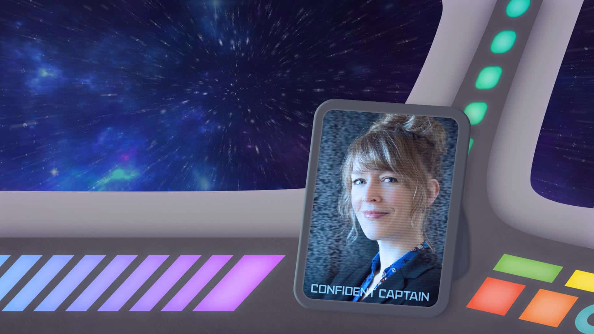
I tend to start off strong, then run out of steam halfway through presentations. Don’t do that. Remember, you’re the confident captain of this conversation. How can you keep the audience hanging on your every word if your delivery is weak sauce? Channel your Captain Kirk and stand up, project your voice, try to pause instead of inserting filler words like um, and bring them along for an unforgettable (in a good way) journey.

By Kelly Schermer

Fill critical gaps in your project teams with an embedded consultant from 2A

We’ve all been there before: spread too thin at work, in desperate need of a specific skillset, without the time or open seats to hire. Considering it takes more than 40 days to fill an open position and costs 75 percent of the employee’s salary just to get them started, lobbying for additional headcount at the moment you’re most vulnerable can feel like a tragic plot twist. Suddenly, the solution to your biggest challenge has just become your new biggest challenge.

That’s where 2A embedded consultants (EC) come onto the scene! We handle the legwork of sourcing someone who can hit the ground running in the role you need, saving you the time and money that goes into it. 2A ECs act as temporary teammates who provide support and subject matter expertise. From junior to senior, left brained to right, and everything in between—our ECs complement your team’s existing skills to help you tackle your gnarliest challenges.

Whether you start off thinking of our ECs as project or program managers, in no time at all you’ll see they’re really the number cruncher, go-to-market guru, or channel whisperer your team needed all along:

Number cruncher—This all-around business manager makes sense of IOs, POs, SOWs, and more to prevent your team’s expenses from going MIA. See how 2A finds teammates, like Amy, to talk some dollars and sense into your budget.

GTM guru—Need someone to help you identify new market opportunities, develop partner and sales programs, and drive revenue growth? 2A marketing masterminds, like Kyle, are ready to help.

Channel whisperer—If you’re looking to increase partner engagement through program planning, training, and recruitment, we’ve got seasoned channel captains, like Laura, who can rally the troops.

Tell us what you’re looking for, and we’ll help you make a match. A few weeks with a 2A EC and you’ll wonder how you ever got along without them.

By Erin McCaul

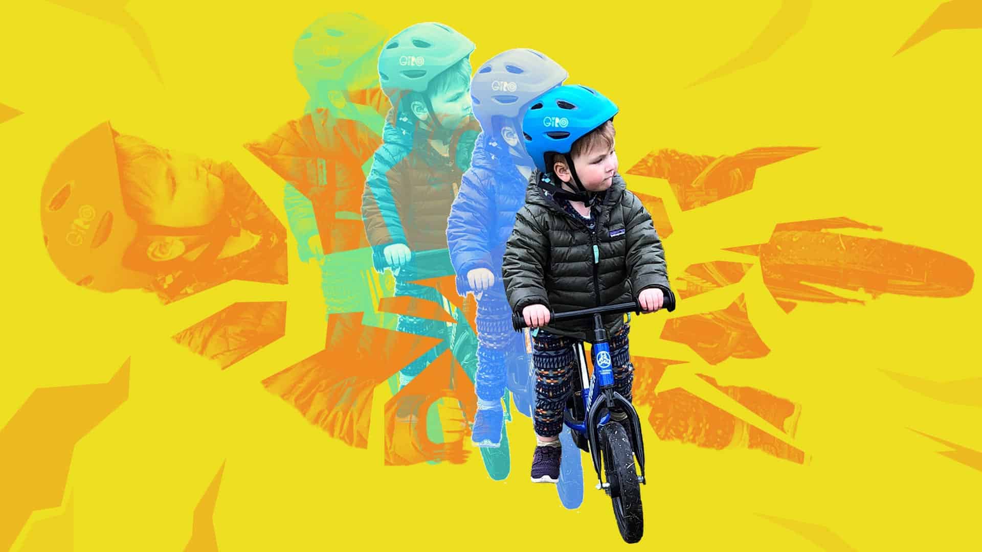
Child riding a bike with a helmet

Like a lot of working parents, my husband and I are juggling our full-time jobs while caring for our 2-year-old, Connor. We fit work into the armpits of our day, keep Toy Story 4 on a loop, and collapse into bed every night feeling like we suck at parenting and our jobs.

One silver lining has been the extra time we have to teach Connor how to ride his bike. The empty parking lot across from our house has the perfect 2-degree slope to give him enough speed to hold his feet up and send it on his Strider. A few days ago, Connor asked to take his bike down a much steeper grassy hill. He’d been doing so well in the parking lot, I decided to let him go for it. Minutes later, I watched his face go from stoked to terrified as he crashed.

He took a handlebar in the chin and bit his tongue, with enough blood to be scary. He didn’t cry for long, and I sat there just holding him for a while after the fall—quietly giving him space to process what happened. I spent that shared silence thinking about how proud I was of this little person for trying something new, bold, and scary—staying curious as he tests his limits.

I thought about how each failure is an input that informs the way we try again. Later on, Connor asked to watch his favorite YouTube video from his hero, professional cyclist, Danny MacAskill. His new favorite part? The crash reel at the end. When Connor woke up the next morning, the first thing he asked was “Momma, we go ride my bike today?”

Adjusting to this new normal feels akin to crashing my bike on Connor’s grassy hill every. freaking. day. I still can’t figure out how to feel good at my job, be a good mom and partner, check in with my family and friends, clean my kitchen, drink enough water, or sleep enough on any given day.

Instead of expecting that I’ll do this new thing perfectly, I’m ready to accept that I’m going to crash, get up the next day—and try again.

By Abby Breckenridge

A collage of film strip, smart phone, scissors, and graphical flourishes.

Did you have plans to create an awesome video case study for your upcoming conference, or an explainer video to tell customers how to get started? Well, your plans have been changed. In an age of distancing we’re not gathering film crews and talent to make marketing videos, it’s just not essential. But there are some good alternatives, and we’d love to help. 

Combine amateur footage with a
professional edit

We’re all spending a lot of time looking at low-quality video of our friends and colleagues talking into the computer—so lean into it. Piece together footage from customers, partners, or subject matter experts, and make a compelling story from afar. We’ll work with you on a concept, point you to some helpful equipment, prep your speakers, edit your footage, add sounds and graphics, and deliver you a final asset. You’ll be amazed at what a professional edit can do to turn your homegrown footage into a powerful, customer-ready video.

Spruce up your webcast

There’s a lot we can do to make a webcast more engaging for the viewer. And these remote events can be the perfect stand-in for that video you just can’t make right now. Start with your customer need, add an expertly crafted talk track, engaging slides, a professional voiceover, some animated transitions, and you have yourself a watch-worthy show.

Make an animation

When live-action footage isn’t available—and even when it is—animation is powerful tool to make your stories mesmerizing. Switch gears away from live-action footage and embrace the power of a well-crafted animation. Your words have more sticking power when they’re choreographed together with illustration, voiceover, and music. And your audience won’t be able to look away.

Your video plans have changed but don’t let that stop you from making a powerful marketing tool your prospects and customers can watch online.

By Abby Breckenridge

Let’s get virtual—hosting captivating events from afar

Switching your in-person event to a virtual one is this season’s must-have marketing move. Everyone’s doing it. So how do you make your webinar a showstopper? Here are our top tips to ensure success.

  1. Invest in getting people there. Send multiple, targeted email invitations and drive them to an engaging registration page with clear takeaways, ideal attendee personas, well-crafted session descriptions, and presenter photos.
  2. Practice makes better. A virtual event can still run into the same logistical kinks as an in-person experience. Be sure to gather all your presenters together for a dry run beforehand, and practice hand-offs between speakers.
  3. Agree on a presenter dress code. Just because it’s virtual, doesn’t mean we can’t see you! When you have multiple presenters, it’s nice to standardize the mood so someone doesn’t show up in a robe broadcasting from their closet, then hand it off to a colleague in a tie.
  4. Anticipate more attendees. It’s far cheaper to send 30 people to an online event than on a plane across the country, so make sure you track registration counts, confirm your online meeting platform can handle high traffic, and give your IT department a heads up—nothing says failure like a mid-session app crash.
  5. Keep sessions short. People get distracted more quickly when they have the whole internet at their fingertips, so limit sessions to 30 minutes.
  6. Plan for too short. Talks tend to tick along more quickly when the speakers don’t have the energy of an in-person audience. Presenters won’t know if their joke leads to chuckles, so there won’t be pauses for laughter. In case of wrapping early, keep your attendees engaged with a fun break experience and a note about when the next session will start.
  7. Tell breathtaking stories. Talk tracks and slides will carry a heavier load than usual, so don’t skimp. Here are our tips for what’s hot in slides.
  8. Share the screen. It’s most engaging to share a visual mix of the speaker, demos, and their slides—that’ll require a producer on the backend to do it well.
  9. Be ready for questions. Attendees will still want to ask questions and make themselves known to the presenter. Use a moderator to gather and share questions or schedule a Q&A where attendees can queue up to ask in their own voice.
  10. Give your content legs. Plan to share resources like event recordings, decks, whitepapers and other related content to capitalize on the momentum.
  11. Don’t drop the marketing ball. Capture and segment all engagement, then plan your next touchpoint, whether it’s a follow-up email, a private demo, exclusive access to an eBook, or something else.

We’d love to help make your just-turned-virtual event a worthy marketing investment. From start to finish—promotion, registration pages, speaker training, talk tracks, slides, follow-up, and project management—we’ve got your back. Drop us a line.

By Anna Mia Davidson

Elevating Stories: Anna Mia Davidson

For more than two decades, photography has been my passion. I’ve used my camera to tell stories that aren’t being told, focusing on diverse cultures, social justice, and environmental issues. For several years, I documented daily life in Cuba, from the urban streets to the countryside. As a recent Elevating Stories presenter, I shared my perspective on visual storytelling and how a willingness to have a point of view can lead to more poignant and connected photographs.

I believe having a point of view about what I’m photographing is imperative. It’s what allows us to see in a deeper more sensitive way. When I embarked upon my Cuba book project, I began the visual journey with a romanticized notion of the Cuban revolution, looking for positive remnants throughout the island nation. But while on location, it became evident there was more to the visual truth that I could unveil. Over time, I better understood the complex dynamics and many layers. In Cuba Black and White I wrote, “it’s easy to romanticize revolution, it’s harder to live in its aftermath.” 

I found beauty and ingenuity amongst struggles. I found a nation waiting for a change and hoping for a rebirth, reflected as a metaphor in my images of the maternity series. In my book I wrote, “It was ultimately within the shadows that I found Cuba’s dichotomies in all their beautiful trying complexities. …  Within revolution there’s music and the rhythm of life happens.” That rhythm of life is the pulse and essence of what Cuba felt like in all its dynamic truths. That is the feeling portrayed in the images in my book.

Achieving this deeper understanding was only possible by adopting a point of view, investing time, listening closely, and approaching the work with a willingness to see things differently.

By Guy Schoonmaker

Dartmouth campaign graphics

When you think of fundraising for colleges and universities, your first thoughts are probably something like “ugh, junk mail and relentless phone calls from students asking for money!”

You’re not wrong, but as a former higher-ed fundraiser, allow me to offer a counter perspective.

What really bugs you, other than paying off student loans (been there), is that you’re getting the same content and message every year, and it’s not personalized to your experience.

Universities aren’t staffed and resourced like Fortune 500 companies. It’s usually one person who is responsible for planning, segmenting, and executing the marketing campaigns. With so much to do, it’s easy to de-prioritize content and lean on the letters, emails, and call scripts from last year.

The Dartmouth College Fund was in a similar situation last fall, planning for a campaign that celebrated the school’s 250th anniversary. But they lacked the bandwidth to create unique, new content worthy of the milestone. That’s where we came in—delivering a feature animation, four GIFs, two emails and an infographic. Altogether, this fresh approach inspired over 4,700 donors to make a gift, nearly doubling the campaign’s 2,500-donor goal.

Content matters. Some super famous tech CEOs might even say “content is king.” We’re here to help when other things get in the way, so you can keep your audience… content.

By Melanie Hodgman

Elevating stories #3: Heather Hansman

When the central character in your story is a 730-mile river, that means swimming at sea level, flying at 10,000 feet, and zooming out across states to capture all perspectives. In our third installment of Elevating Stories, we followed Heather Hansman down a natural storytelling path where she explained the secret to weaving together many points of view.

As part of the research for her book, Down River: Into the Future of Water in the West, Heather paddled 700 miles of the Green River in a solo pack raft from source to confluence, getting a firsthand look at the ongoing fight over water rights on the largest tributary of the Colorado River. Along the way she interviewed stakeholders such as ranchers, farmers, conservationists, and city officials while learning about the river itself at water level. Her book expertly bridges science, adventure, and conservationism, bringing together information from different camps to enlighten the reader.

Heather makes it look easy to build multiple perspectives and storylines into one narrative. Here are three tips we learned for making sure the big picture captures it all and keeps your audience engaged:

  • Take a journalistic approach. Do extensive background research to understand the subject matter and build a comprehensive story. Once you speak the language of a topic you can write accurately and authentically.
  • Don’t act like an expert if you’re not one. You need a solid foundation to ask the right questions, but then let the experts do the talking. This allows you to listen and discern the most salient points.
  • Make your narrative action oriented. Weaving in some adventure keeps the audience hooked. The tricky part is to stay true to your thesis and main points.

Heather reminded us that solid storytelling starts with asking the right questions and a having willingness to go on a journey to learn more.

By Mitchell Thompson

PowerPoint crystal ball

At 2A, a lot of our design efforts go into shaping presentations to tell a great story. We’re constantly pushing the limits of what’s doable in PowerPoint, striving to make presentations interesting and engaging rather than a bland slog through bullet points. Making them sing requires staying on the pulse of the latest trends. With a new year upon us, here are some hot design tips to make sure your presentations aren’t trapped in the past.

Sanding off the edges: removing the details from illustrations and icons

Screens are becoming capable of higher definition all the time—from Apple’s Retina to Microsoft’s ClearType to 4K TVs. But rather than cramming details into every pixel available, the savvy designer takes a simpler approach to the crisp clarity provided by high-res screens. Here’s what’s hot:

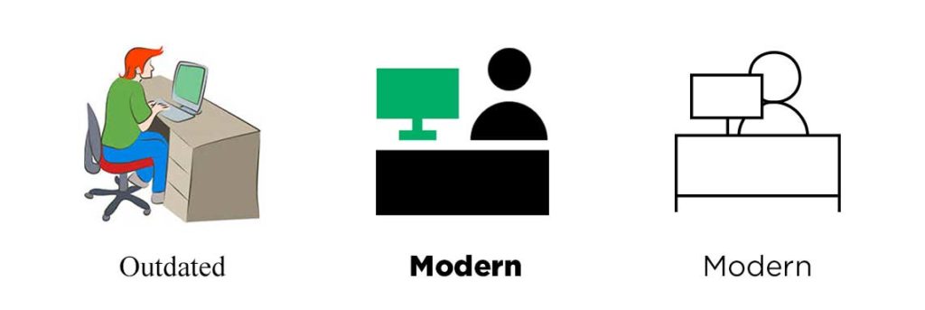
  • Illustrations are headed toward one of two minimalistic paths: solid block colors or open outlines.
  • Icons are becoming more abstracted rather than finely detailed.
  • Similar graphic styles are used to communicate information; for instance, infographics are replacing charts, visualizations are superseding text.

Our advice? Embrace those designs. Viewers can only take in so much visual information, especially when it’s accompanied by a speaker. Cutting graphics down to the bare minimum will make sure audiences take notice of what you want to emphasize. Gain a little pop by combining text and minimalistic graphics to concisely communicate information.

Outdated vs Modern icon styles

CAN YOU HEAR ME NOW‽ Typography is getting bold with all caps

Maxi typography, which uses all caps and often dominates the page, is a growing trend in design. Look for:

  • Bold, all-caps, sans-serif fonts that serve as the hero and emphasize titles and text.
  • Full bleed layouts as the backdrop for maxi typography, making the text jump off the page and immerse the viewer.
  • Larger text means that photographs and texture can be placed inside typography to draw the eye.

Regular text vs Maxi text

As we like to say, “less is more work.” Like streamlined icons, just because something is simplified does not necessarily make it easier! Careful planning will go a long way toward helping your text make its greatest impact. Get ready for some louder typography in 2020—your words are going to make a statement.

It’s morphin’ time: PowerPoint threads the story with motion

First introduced several years ago, PowerPoint’s Morph transition is gaining a foothold as presenters realize its full potential. You’ll see more of Morph in 2020 because it provides an incredibly easy way to add elegant visual transitions. Here’s what you need to know:

  • Instead of spending hours assembling complex animations, Morph allows you to naturally and easily revise motion as you design in PowerPoint.
  • Morph or Fade can work wonders to flow content between slides, smoothly guiding viewers through your story.
  • Animation and transitions in PowerPoint are extra effective when combined with the graphic and text treatments discussed above.


As we move into a new decade, it’s exciting to see how presentation methods continue to grow and evolve. Let’s leave the days of “death by PowerPoint” behind and forge dynamic new presentations!

By Erin McCaul & Rachel Sacks

Accessibility

Imagine climbing a mountain with only one arm. In the documentary Stumped, Maureen Beck does just that. “We don’t climb to be special, we don’t climb to win some silly awards,” she says in the film. “We climb because we love climbing just like everybody else.”

When we think of disabilities it’s easy to think of the physical challenges people like Maureen face. But in today’s modern world, where many of our public spaces have been changed to support those with disabilities, it’s our digital spaces that lag behind. When design is approached from a human-centered perspective with disabilities in mind, everyone can benefit from more accessible products.

Who hasn’t appreciated closed captioning at a noisy event, an elevator instead of stairs, or audio books? Additionally, by making these accessibility features out in the open and available to all, they become less stigmatized and individuals are empowered to select interaction methods that work best for them—regardless of ability.

Here at 2A, we’re putting people front and center in every step of our web development process. Our design team is constantly checking for contrast and font sizes to help people with low vision read more clearly. We design our sites with alt text and tab stops to help people who are navigating with a screen reader. And our development team tests our websites in staging environments before anything goes live to make sure we’ve incorporated accessibility measures.

Do your part

Ready to start doing your part to make the web more accessible? Here are some places to start:

  • Read up on Web Content Accessibility Guidelines (WCAG) to understand how websites can become more accessible. WCAG measures website content and accessibility by four criteria: perceivable, operable, understandable, and robust.
  • Install the Chrome extension Accessibility Insights for Web. This tool allows you to run quick automated tests that can catch 30-40% of the most common WCAG issues such as low contrast text, missing alt text, and tabbing.
  • Involve people with disabilities in your user testing to accurately uncover usability issues. Having them test your primary workflows with tools they already use is a great way to pressure test your digital experiences for accessibility. Be sure to offer compensation for their time (everyone loves gift cards)!

Small steps toward a send

In climbing the term “send” means to climb a route without falling. When climbing a difficult route, it’s common to try multiple times before sending. Failing forward is just a part of the process. Designing for accessibility is kind of like sending—it’s not going to happen right away, but with enough small steps we can achieve big changes to make the web more accessible for everyone.