By Kelly Schermer

We’re coming into the holidays, and you know what that means—it’s time to add a little sparkle and get a little tinseled. After all, there’s nothing like sprucing up to get attention. You might say it works the same way in B2B technology marketing, although (spoiler alert) it’s highly unlikely that blow-up characters and garish lights will seal the deal for you. Not to worry, we’ve got something better to last the whole year through. 

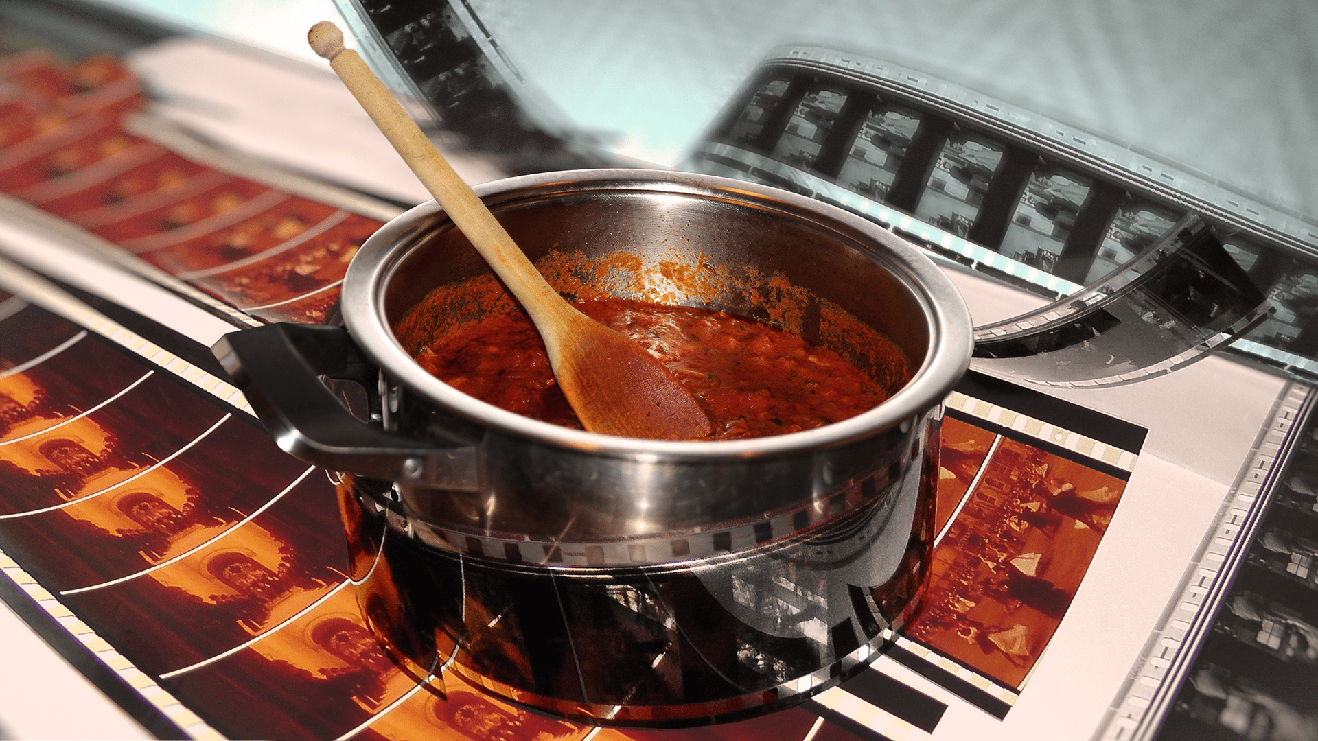
At 2A, we’ve come up with a full-stack approach to lighting up your marketing assets. We put engaging copy and arresting design into motion, creating a scrollable, interactive web experience. You can full-stack just about any written content—from case studies to ebooks to you-name-it-we-can-do-it! It’s a surefire way to put a fresh spin on an asset that’s just too good to miss.  

Recently, we created a full-stack experience for WeaveWorks to add some twinkle to their GitOps ebook. While the content is the same as our PDF version, the experience appeals to a whole new audience and effectively extends the asset’s reach. 

“Removing the barrier of logging in, downloading and waiting for an email allows us to deliver our ebook content to prospects faster,” said Sonja Schweigert, VP of Marketing at Weaveworks. “Giving ours the full-stack treatment allows people the option of scrolling through the content from the convenience of their phone or tablet instead. It’s a nice change from a typical webpage asset, because we can meet the reader on the device and channel of their choice and still give them the full story. 2A Consulting not only wowed me with timely and superb execution but also delivered an outstanding content and design experience for our clients.”  

Curious about how the full-stack technology works? Erin, 2A’s head orchestrater behind the process, takes you behind the scenes of our case studies on the 2A website.  

Curious about how to make the full-stack experience work for you? Give us a ringle jingle!  

By Erin McCaul

Tips for the 2020 holiday season

When November rolls around each year, my friends and family who celebrate Christmas divide into two groups: those who put their trees up before Thanksgiving, and those who wait until their turkeys have time to cool. I personally fall into the latter camp—and throw some serious side-eye at anyone who plays “All I Want for Christmas Is You” before Black Friday.   

But this year has been heavy, and 2020 isn’t closing out like any other year. My entire workday has turned digital, and like many families—we’ve decided to take our holiday gatherings digital too. However you celebrate, here are a few tips to help make the holidays special this year.  

Shop early and support small  

COVID-19 closures have hit small businesses hard. If you’re gifting, consider buying local, buying handmade, buying gift certificates for services, or buying from people you know. A key to supporting small is shopping early. Lots of independent bookstores, small shops, and artisans take online orders, but they need some extra time to package and ship everything off.  

And if you’re as sick of your own cooking as I am, consider restaurant gift certificates—or getting takeout over cooking your own holiday meal. Love libations? Many local breweries and wineries are offering curbside pickup as well. 

Get creative with your digital celebrations  

This year, everyone in my family is getting a Christmas package that includes Christmas crackers, over-the-top Christmas costume gear, and paintable wooden ornaments. If I can’t see them in person, I want to see them in reindeer antlers and blinking Christmas-light glasses over FaceTime. If your crew isn’t excited about blinking glasses, consider a holiday slideshow of old pictures to reminisce, or throwing together a trivia night to keep things light. 

Give to a charity  

2020 has brought unimaginable hardships to our communities. Food insecurity—already an issue—is on the rise. Millions of Americans are out of work. Schools are closed. Already vulnerable communities are suffering the most. Consider setting aside some of your holiday budget for charities or food banks, or even setting up recurring donations to give organizations near and dear to your heart steady funding throughout the year.   

I miss hugging my grandma. I miss seeing my friends. I miss schools. I miss my office and sitting in an actual conference room with my team. I miss crowded bars and waiting to be seated at restaurants. I’m tired. But I’m starting to see Christmas lights in yards and in town, like little lights at the end of 2020. And if your Christmas tree was up in October, I now say good for you.   

By Mitchell Thompson

Be present, think lateral with Oblique Strategies

Ask your body. Turn it upside down. Do something boring.

We’ve all heard of thinking outside of the box, but how do you really do it? Famed non-musician Brian Eno and multimedia artist Peter Schmidt developed a unique approach called Oblique Strategies to break through creative barriers. Oblique Strategies is a deck of cards with short phrases meant to introduce constraints or reframe the problem at hand and encourage lateral thinking. Prompts like Ask your body and Turn it upside down help kickstart creativity with somewhat removed and roundabout thoughts.

This year has presented us with a plethora of new challenges to overcome, and it’s obvious that our old way of doing things isn’t cutting it. Curiously enough, the Oblique Strategies hinting at mindfulness have been surprisingly helpful for me lately. I’ve been questioning if I’ve made good use of the time I’ve gotten back from the disappearance of things like commutes and recreational shopping. Strategies like Do nothing for as long as possible and Remember the quiet evenings have a meditative quality and are grounded in gratitude. We’re often so driven by our goals that the pleasure of the moment is lost in the desire to get somewhere as quickly as possible.

There are no correct ways to apply Oblique Strategies. The journey is the destination—lateral thinking puts us in a place to see and understand more. Perhaps the ultimate secret is to stay mindful of where we are and what’s right in front of us. Here are three examples of how to interpret Oblique Strategies to stay in the moment while overcoming obstacles.

Embrace the constraints

A line has two sides. Instead of trying to see through something, look around it. Accept the boundaries you have to work with (like time, medium, or purpose) and spend your time exploring the open space that exists around them. That doesn’t mean accepting things at face value, but truly understanding the box that you’re trying to think outside of. Constraints present a structure, and once we acknowledge the structure, we can begin to create ways to use it in our favor.

Practice the failure bow

What mistakes did you make last time. We’re fallible. To deny that is to deny room for growth. Not all strategies will lead directly to the end goal (they shouldn’t, really), but gracefully accepting failure and letting it flow through allows us to get one step closer to true success. If we look closely at the most embarrassing details and amplify them we are welcoming the opportunity to learn from mistakes and cultivating a culture with less ego. In essence, failure is far more powerful for learning than engineering a string of successes—so celebrate those moments!

Unlearn what you’ve been taught

Discover the recipes you are using and abandon them. Many of the processes we’ve learned were developed for a different time and place, so it’s more important than ever to truly step away from the orthodoxy. When time is of the essence this can be a challenge, but prioritize the idea and allow yourself a moment to view something with a child’s eyes and entertain the ridiculous or unexpected.

No matter what you do, accepting what cannot be changed, welcoming failure, and not being afraid to let go will enable out-of-the-box thinking. But maybe more importantly, just Go outside. Shut the door. And Breathe more deeply.

By Laurie Krisman

3 cures for healthcare storytelling

Sometime in early March of this year, just when kids exited playgrounds and rushed home to continue learning online, healthcare organizations pivoted. Almost overnight, COVID-19 dramatically accelerated the pace of digitization. Pilot projects like remote patient monitoring, telehealth, and scalable remote work environments suddenly took center stage. And as contact tracing and vaccine management changed our lives, the value of integrated data became more important than ever.

As storytellers at 2A, healthcare marketing is on our minds. Considering how healthcare technology has evolved and patient expectations are changing, now is the time for healthcare organizations to rethink how they engage customers. If you’re building marketing strategies that target specialized clinical personas, here are a few timeless guideposts to follow.

1. Balance self-promotion with education

It’s simple: organizations that create high-quality, strategic content generate more leads than those who do not. It makes sense that customers tend to engage with material that brings them entertainment, new knowledge, or skills. So, when building marketing assets like eBooks, infographics, and whitepapers, aim for a balance of educational and self-promotional content that’s relevant to your customers’ lives. For example, this eBook we created for Amazon Web Services and Infor gives healthcare organizations ready-to-deploy ideas for implementing cloud technologies to become more resilient in the face of healthcare transformations.

To generate new content, it always helps to stay up to date with the latest technologies, news, and challenges, so you can be the first to drive home a new insight. 

2. Aim for re-posts and shares on social

Content is key, but so is the vehicle. When it comes to social media, there are many platforms where you can share your message, but finding the right placement helps ensure you’re reaching your target audience. In B2B healthcare marketing, Twitter and LinkedIn are typically good choices. Why? Because influencers and subject matter experts can re-publish your content, giving it the added component of advocacy. Take this approach a step further by being creative and finding new ways to be seen.  

3. Remember, B2B loves animation

In the world of digital content, animation is becoming the crown jewel. As a response to digital fatigue, when people see a moving illustration our brains make a heroic effort to understand what it’s looking at. Plus, animations usually include expressive visuals, an interesting narrative, and music—a great recipe for memorable content that communicates your business value to customers. Take, for example this animation we created for the enterprise patient mapping solution, Verato.

As innovations in healthcare evolve, we’re excited to drive new content marketing programs that continue to amplify the message with proven tactics. Need more eyes and ears on your latest breakthrough? Give us a ping.   

By Nick Dwyer

A new flag day

America’s trajectory hangs in the balance this November, but one of the ballot measures I’m most excited about is one I cannot vote on. In six days, Mississippi voters will have the opportunity to approve or reject the final design for a new state flag. After more than 20 years of serious efforts to replace the old racist flag, which featured the confederate stars and bars, widespread protests stemming from George Floyd’s murder finally turned the tide with state lawmakers this summer.

I’m excited not just because this marks the removal of a hateful symbol, but because I’m a lifelong vexillophile—a lover of flags. In many ways, what I love about flags is what I love about marketing: the limitations. There is so much to say and represent, but just like marketing, flags depend on simplification to be effective. So, let’s review the proposed flag design through the lens of some classic 2A adages that help shape our approach.

Image of proposed Missipppi state flag

Less is more work

Like our marketing work, the best flags do more with less clutter. Flags flap, drape, and must be recognizable from afar, so they should be designed for practicality. Mississippi’s  new proposed flag benefits from simple symmetry and limited colors, but unfortunately it includes lettering. It’s not the designers’ fault, the words “In God we trust” had to be included. Lettering doesn’t scale down well, is impossible to read at a distance, and makes production more complicated. South Carolina and New Mexico have perhaps the most iconic state flags—in part because they have no letters at all.

South Carolina and New Mexico flags

Find the nugget

There can be a lot of noise on marketing projects, making it hard to figure out the focal point. One message needs to shine above the rest to communicate what’s most important. In the new flag design, there’s no doubt that the centerpiece is the southern magnolia, Mississippi’s state flower and tree. Trees can be beautifully symbolic, just look at Canada or Lebanon, and this flower is instantly recognizable to anyone familiar with the Magnolia State. While the flower is an effective central element, it would be more emphatic without the ring of 20 white stars, which represent Mississippi as the 20th state.

Image of Canadian and Lebanese flags

Know your audience

Everyone loves to think of themselves as marketers, but great marketers remember they’re probably not the intended audience. This flag must represent the people of Mississippi. Polls show that nearly half the state wanted to keep the old flag, but the new flag features symbols with broader appeal than the old icons of division. You can’t make everyone happy, but it’s clear more people can take pride in this design.

If any Mississippi voters are reading this, I’ll leave you with one more aphorism I like to repeat at 2A: strategy is about tradeoffs. This new design cannot include everything you might have wanted, but it pops the right elements to serve your state with dignity and hope.

By Erin McCaul

Bring a little orchard to your doorstep

After reading The Omnivore’s Dilemma in 2010 I became a farmer’s market loyalist. I live for the first tomato of summer, love the sweet crunch of an over-wintered carrot, gush over peaches, and—much to my toddler’s dismay—refuse to buy bananas. So when Claire Lichtenfels and her husband Hal Jackson asked 2A to redesign the website for their small family-run farm, Whitestone Mountain Orchard, I knew it was my chance to put my pastoral passion to use. I instantly clicked with Claire and Hal, appreciating them on another level for their regenerative agriculture practices and support for local communities.

While it’s easy to miss the magic of food in a well-lit grocery aisle or PrimeNow delivery bag, this site was our opportunity to bring some farm goodness back to the shopping experience—and a few apples to your door.

Every heirloom has a story

Claire and Hal chose 2A because of our focus on storytelling. As owners of a third-generation orchard, it was important that their mission to promote the viability of local farms be front and center on the site, with plenty of information about the diversity of fruit they grow. We’re all used to Galas and Honeycrisps, but what about Stayman and Ashmead’s Kernel? Apples and pears are harvested August through January, and Claire and Hal are equally excited about every tree in their orchard. For each variety, we crafted mouthwatering descriptions, elevating the sweet snacks and seasonal stars. Their site has something for everyone, from apple subscriptions to gift boxes, and my personal favorite—the heirloom pie box.

Step into Oma’s kitchen

Claire and Hal radiate warmth, kindness, and good humor. When designing their site, we crafted custom linocut icons and paired them with photos of the farm. It all works together like a patchwork quilt—transporting you straight to the orchard. Perusing “The pantry” section of the site, I can imagine stepping into Claire’s kitchen, where like any fun Oma, she’s ready to show you how to make dried apples, or whip up some fruit butters to carry those fall flavors into winter oatmeal and toast.   

Treat yourself to some fall flavor

In a world of digital conveniences, eating seasonally brings a little magic to my menu. Plus, supporting small, local farms is my favorite way to give big agribusiness and monocropping the middle finger.

If you love apples, consider following Whitestone Mountain Orchard on Instagram and Facebook, or treating yourself to a box of seasonal goodness, delivered to your doorstep. I know I’ll be gifting some lucky friends and family holiday pears and heirloom pie boxes this year!

By Rachel Adams

Designing the abstract

When I graduated college in 2011, artificial intelligence and machine learning were not topics that surfaced regularly in our graphic design classes. Now, almost 10 years later, as a designer at a B2B storytelling agency, I’m creating technology marketing materials for these abstract concepts on a daily basis. It can be intimidating designing for big tech ideas, but here are a few tips I’ve learned to help navigate the process.

Go with what you know

Certain design metaphors already exist in tech marketing, like a lock representing data security. There is sort of this unwritten rulebook of icons for designers. Sometimes these icons make sense and sometimes they feel like a stretch, either way it is a good North Star. For example, I understand why a cloud represents the cloud but ever wonder why a can represents a database? Assigning a design element to an abstract idea makes it feel more tangible and helps tell a story in a visual way.

Be original

While there are some general tech marketing design guidelines that exist, each project is different. As an agency, we want to give clients unique designs so not every keynote presentation looks the same. Always look to a company’s brand guidelines and try to get creative about how brand details are incorporated. Elements like color, pattern, and iconography are cues we can massage into the design to ultimately delight the client with a final product that stands out.

Don’t forget fundamentals

Even though these tech themes can be abstract, it’s important to keep in mind the fundamentals of design. A website layout still needs to have some sort of hierarchy, words on the page of an eBook need to feel balanced with the visuals, and an infographic should guide the viewer through a story. Using these visual elements in the right way make these big ideas easier to digest.

Eventually we will have to visualize abstract concepts that haven’t been thought of yet. What comes next beyond artificial intelligence and machine learning? It will be interesting to see how the design of tech marketing evolves. I hope it’s something fun and colorful…like rainbows or trolls.

By Katy Nally

I find myself saying “Damn you 2020!” more frequently the closer we get to wrapping this dumpster fire of a year. So many bright spots were snuffed out by 2020, including dozens of events that ended up on the chopping block. For 2A, we skipped our annual summer party, which is normally a non-stop, oyster-and-champagne-fueled mingle-thon.

But fortunately, some good came from canceling our summer event. Turns out 2020 can’t take away our ability to support organizations in our community who do tremendous work. We polled the office and donated to a shortlist of nonprofits, including:

Friends of Youth
Atlantic Street Center
Mary’s Place
Africatown Community Land Trust
Mockingbird Society
Choose 180

We’re bummed our summer party was nixed, but we’re glad to see our donations make the rounds—even if we can’t.

Here’s looking at you, 2021!

By Mike Lahoda

Remote onboarding is like flying an alien spaceship

At 16, I started my first job as a busboy. The most memorable part of that first day was meeting the bartender, Ryan. He didn’t even introduce himself. He just looked me in the eye and launched into an Oscar-worthy recital of Bill Pullman’s speech from Independence Day. You know, the one just before the ragtag team takes to the skies to fend off the aliens. The waitstaff assembled behind me and cheered as Ryan climbed onto the bar and finished his address, fired up for a night of slinging wings, pouring drinks, and defending the earth from alien overlords. I was pretty confused.

Leading up to my start at 2A, I was a bit nervous about the remote onboarding process. Starting any new job can be stressful, and with the addition of being remote I worried about feeling lost in space. Fortunately, Planet 2A is home to some of the friendliest, smartest humans in the galaxy, which made for a stellar onboarding experience. Here are my tips for getting up to lightspeed when beginning a new job remotely. 

Study your spacecraft

When Will Smith and Jeff Goldblum pilot the alien spaceship for the first time, they accidentally set off in reverse and almost crash. That’s kind of what starting a new job is like: there are a lot of unfamiliar buttons and you’re not sure what each of them do or when they should be pushed. Be patient and learn from others before flying solo.

Have a Will Smith to your Jeff Goldblum

You’re going to need a good co-pilot, and my manager Annie is an ace. In addition to frequently checking in with me, Annie guided me through our 2A Living Practice trainings, had me shadow her in client meetings, and answered the millions of questions I asked. She’s at the controls beside me as I take off on my own projects. 

Make contact and show that you come in peace

I made it a priority to schedule meetings with my teammates. In the dark void of space—I mean, the remote-working world—there’s no watercooler talk or popping over to a colleague’s desk to brainstorm. I’m still waiting on holographic communication, but video chat is a capable substitute, especially in one-on-one and small-group settings.

We’re living through a strange time. In 2020, the prospect of waking up to news headlines of invading extraterrestrials seems entirely plausible. Work is different now. If you’re starting a new job remotely, remember that this is uncharted territory for everyone. It will require patience, trust, and communication as we learn new ways of working together from the comfort of our own home planets.

By Kelly Schermer

Book within colored swirls

My family has never let me live down the Christmas morning that I took charge of the video camera and escorted my loyal viewers on a tour of the table—from an ant’s perspective. To hear them tell the story you would think it was part of a premeditated plan to make them all sick. As it turns out, it was an excellent warm-up for Ana Pastor’s writing class that I took through the Hugo House.

In a nutshell (or an ant’s bathtub, as some of us prefer to think of it), the class followed Raymond Queneau’s book Exercises in Style, and taught us how to walk around and through and over and under a story. We started by writing a very simple story in the style of notation and then practiced 15 of Queneau’s 99 variations, including retrograde (telling it backward) and animism (giving the agency of the story to non-living things).

Did I get tired of thinking about my story? You bet. Were any two tellings of it remotely the same? No way. Turns out, you can say something again and again and again with varied results. Super interesting for a bunch of word geeks like my 2A posse.

And therefore, and so with, and wherein, I invited workmates to join me for a virtual lunch and test a couple of Queneau’s styles on our own unremarkable stories. We did notation, retrograde, and dream (in which you say it like it was…. well, a dream). Here are some of the results:

 Toddler strollin’ and podcast rollin’

  • Notation: Getting my kid ready for school takes 30 minutes when it should take 5. So sometimes I run him to school instead of walking him to school. And either way I get to listen to a podcast alone on the way home, which is a win.
  • Retrograde: I started my morning alone listening to the NPR Politics Podcast after running my kid to school in our jogging stroller. It was a lovely slice of “me time” after negotiating with a toddler to put on shoes for 10 minutes.
  • Dream: I show up to drop my kid off at school, but there’s a mom test I didn’t study for. All the other moms read the email and studied, but I missed the email and had no idea there was a test.

Zen and the art of dishwashing

  • Notation: I put on headphones and walk into the kitchen. I scroll for some music or a podcast.  I stare out the window. I turn on the water and wash the dishes.
  • Retrograde: I turn the water on and wash the dishes. I stare out the window. I scroll for some music or a podcast, after walking in the kitchen and putting my headphones on.
  • Dream: I float into the kitchen. Noise is everywhere. I look out the window and see our neighbor, my uncle, and old boss floating down a river.

Thin-soled, thick-skinned runner

  • Notation: I stepped on a rock while running in my thin-soled shoes. My foot seemed fine for the remainder of my route. When I stopped running, my foot began to hurt.
  • Retrograde: My foot hurts, like it’s bruised on the bottom. It seemed fine when I was running just a couple minutes ago. I guess I did step on a rock with my thin-soled shoes.
  • Dream: I stepped on sharp stones, I couldn’t avoid them no matter how hard I tried, but I was able to continue on without pain. As I slowed the stones disappeared, and my feet felt cold.

Cool, right? Same ideas, same words, different stories. In summation (please approach the following as a choose-your-own-adventure call to action):

  1. If you’re feeling stuck in your writing, take a page from Queneau’s book and try a different angle or 78 of them.
  2. If you, too, need a fun way to give everyone at work a brain reboot, run an Exercise in Style workshop.
  3. If you’re more of a picture person than a word geek, check out Matt Madden’s 99 ways to tell a story to see how boss he was at making this technique his own.
  4. And, if you’re tempted to hijack a family holiday in favor of building empathy for ants, just hand over the camera.